Overview
Via Pulsa Mobile App is a platform aimed at simplifying the purchase of mobile credit and topping up e-wallets. It caters to users who frequently need fast, reliable, and straightforward transactions. The app is designed to ensure users can quickly and easily complete their transactions with minimal effort, using a clear and intuitive interface.
Goals
The primary goals of the app’s design are:
- Simplify the top-up process: Minimize the steps needed to complete a transaction, making it as seamless as possible.
- Create an intuitive user interface: Make the app accessible to all users, regardless of their technical proficiency.
- Ensure transparency: Provide clear, upfront information about fees, costs, and transaction details.
- Enhance the user experience: Focus on reducing friction in transactions and offering a smooth user journey from start to finish.
The User & Audience
The target users for the app are:
- Mobile users: Individuals who frequently need to top-up mobile credit for themselves or others.
- E-wallet users: People who use digital wallets for daily transactions and need to quickly replenish their balances.
- Tech-savvy and non-tech-savvy users: The app needs to be accessible for users of all ages and tech abilities.
- Small business owners: Entrepreneurs who need to manage mobile credit for multiple lines.

Role & Responsibility
As a Product Designer, my responsibilities included:
- User research: Understanding user behavior and pain points through surveys and interviews.
- Sketching and wireframing: Creating early design sketches and wireframes to visualize the app flow and features.
- UI/UX design: Designing an intuitive and visually appealing interface.
- Prototyping and testing: Developing prototypes for user testing and gathering feedback to improve the design.
- Collaboration: Working closely with developers to ensure design feasibility and consistency during implementation.
Tools Design
- Figma: Used for wireframes, prototypes, and high-fidelity mockups.
- Adobe XD: For rapid prototyping and interaction design.
- Sketch: For initial sketching and wireframe creation.
- Miro: For user journey mapping and brainstorming.
- UserTesting: For collecting feedback from real users and improving the design.
Scope
The scope of the project involved:
- User flow design: Designing the process for top-up transactions, starting from the home screen to confirmation.
- UI/UX design: Creating the layout, typography, color scheme, and interaction elements for the app.
- Transaction management: Ensuring users can view transaction history and easily repeat common tasks.
- Support and feedback: Including user-friendly ways to access help and feedback within the app.
Process
User Research:
- Conducted interviews with potential users to understand how they interact with existing top-up services and identify their pain points.
- Developed personas representing different user segments, such as casual users, small business owners, and tech-novice individuals.
Sketching:
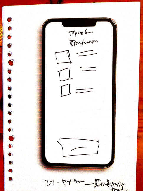
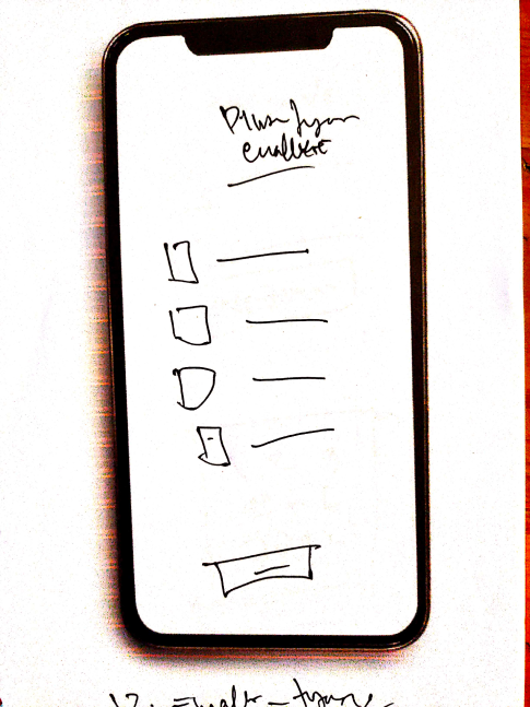
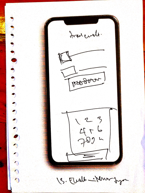
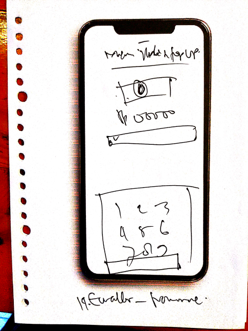
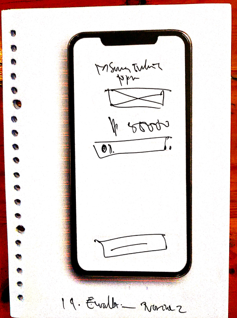
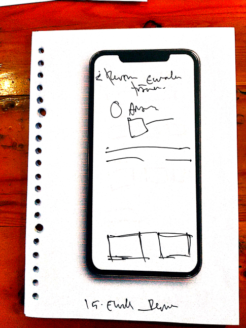
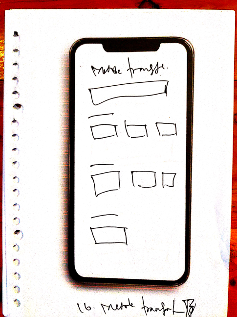
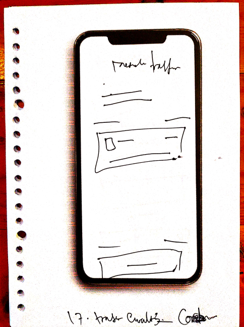
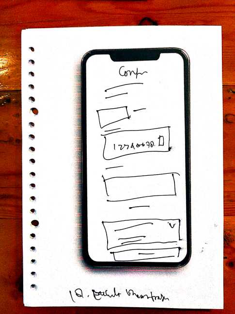
- Early sketches focused on simplifying the user journey by minimizing the number of steps required to complete a transaction.
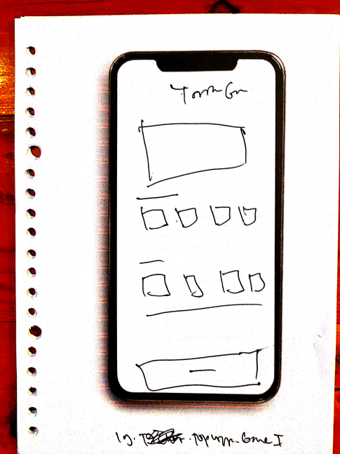
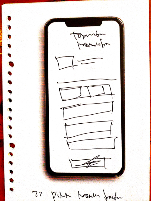
- Sketches included:
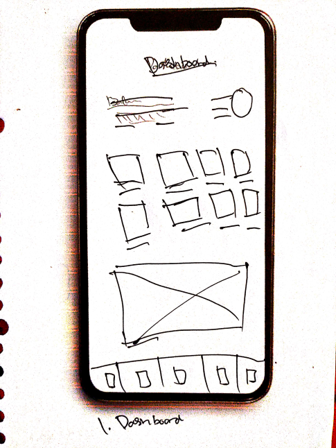
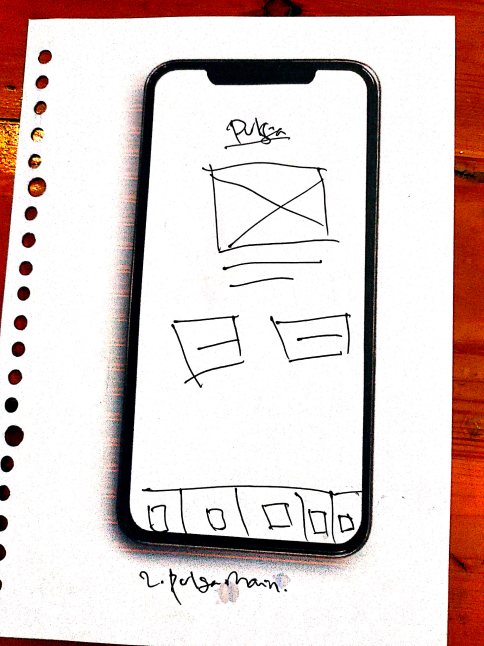
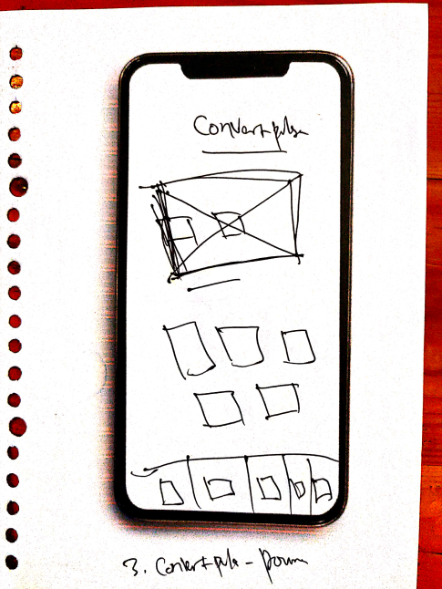
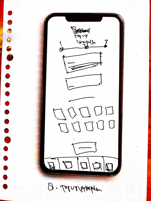
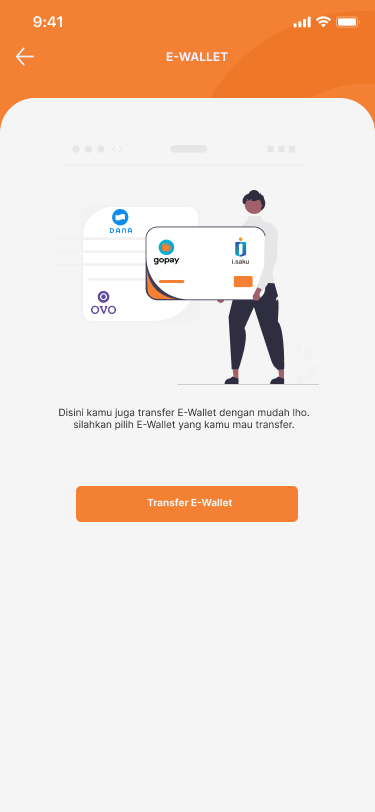
- Home screen with top-up buttons for mobile credit and e-wallet.
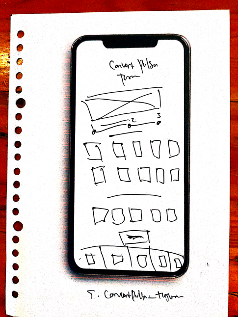
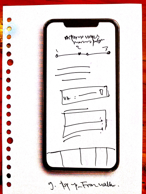
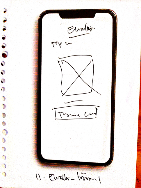
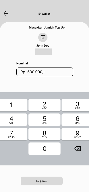
- A streamlined transaction flow where users select the amount, confirm details, and choose a payment method.
Wireframing:
- Based on the sketches, wireframes were created to outline the basic layout and structure.
- Wireframes helped visualize key screens such as:
- Home screen.
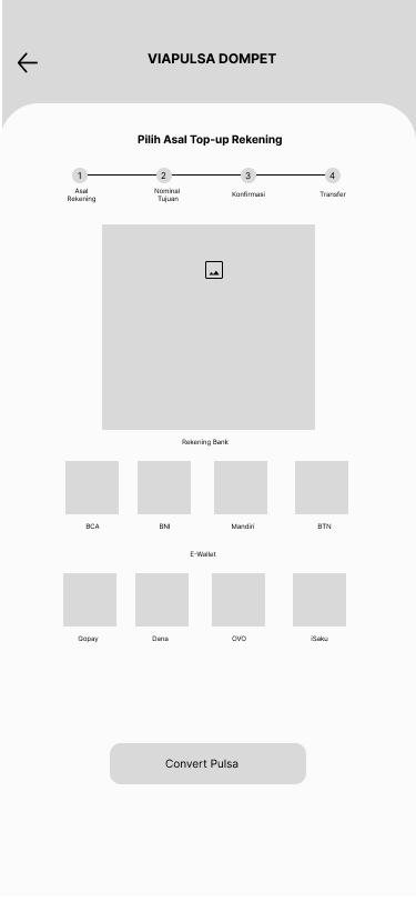
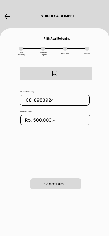
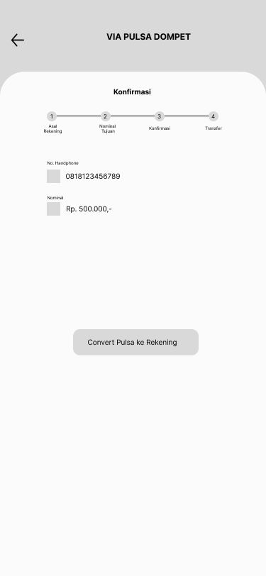
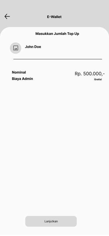
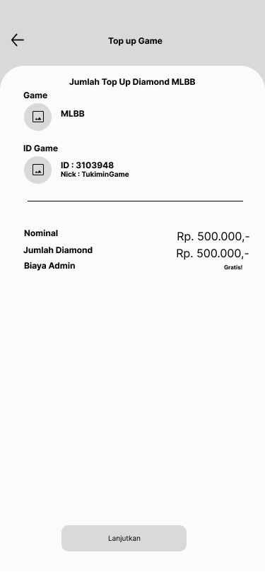
- Top-up selection and confirmation.
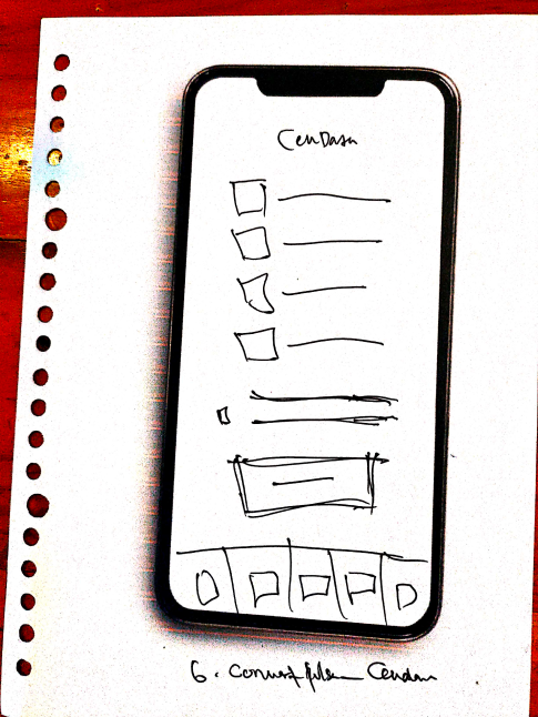
- Transaction history page.
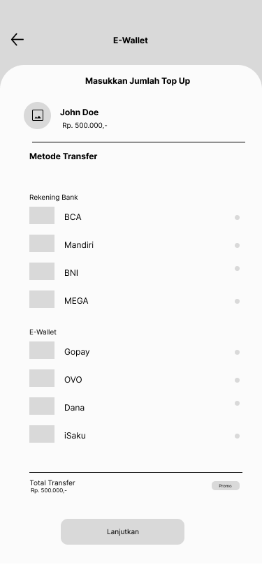
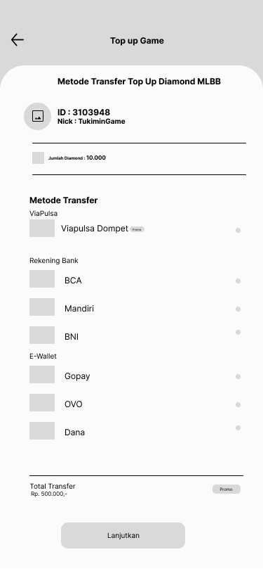
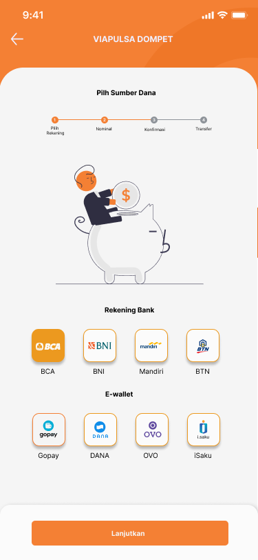
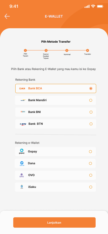
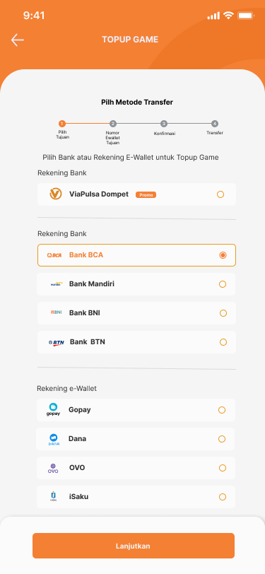
- Payment method selection.
Prototyping:
- Interactive prototypes were created using Figma to test the flow and interactions before finalizing the design.
- Users were able to navigate through the prototype to simulate real transactions.
User Testing:
- Usability testing was conducted with real users to gather feedback on navigation, transaction clarity, and the overall user experience.
- Key insights from user testing were used to refine the app, simplifying navigation and improving the feedback system.
Inspiration
Inspiration was drawn from apps like GoPay, DANA, and PayPal, which provide simple and efficient ways to manage mobile credit and e-wallet balances. The focus was to blend the clean design and intuitive flows of these apps while making the process even more streamlined for users who are focused solely on top-ups.
Sketching
During the sketching phase:
- I focused on minimizing the cognitive load by simplifying each screen with clear options.
- The home screen sketch emphasized two primary actions: “Mobile Credit Top-Up” and “E-Wallet Top-Up,” allowing users to quickly start the top-up process without extra navigation.
- Sketches also included quick links to transaction history and saved numbers or wallets for returning users.
Struggle
Some of the challenges encountered were:
- Balancing simplicity with functionality: Ensuring the app remained simple while still offering all necessary options, such as different payment methods, detailed transaction history, and support features.
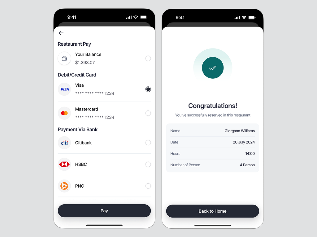
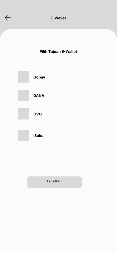
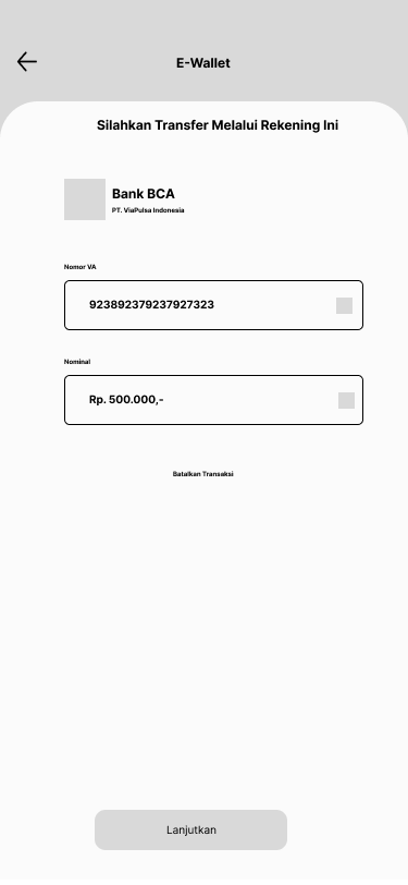
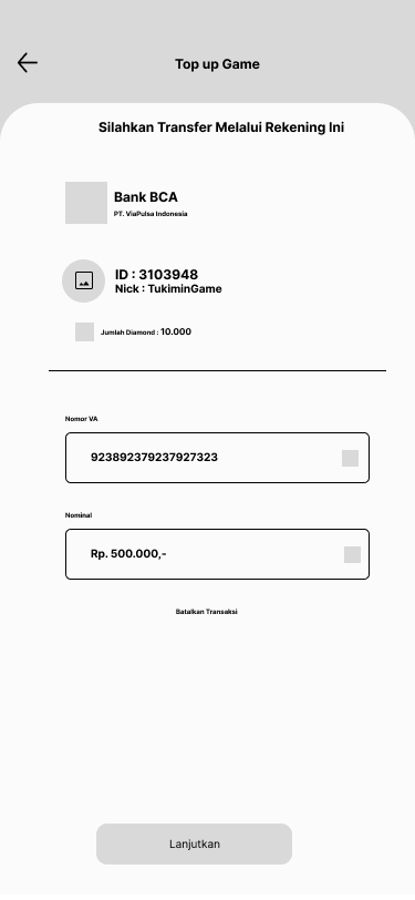
- Handling multiple payment methods: Integrating different payment methods (bank transfer, credit cards, e-wallets) without complicating the user journey.
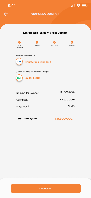
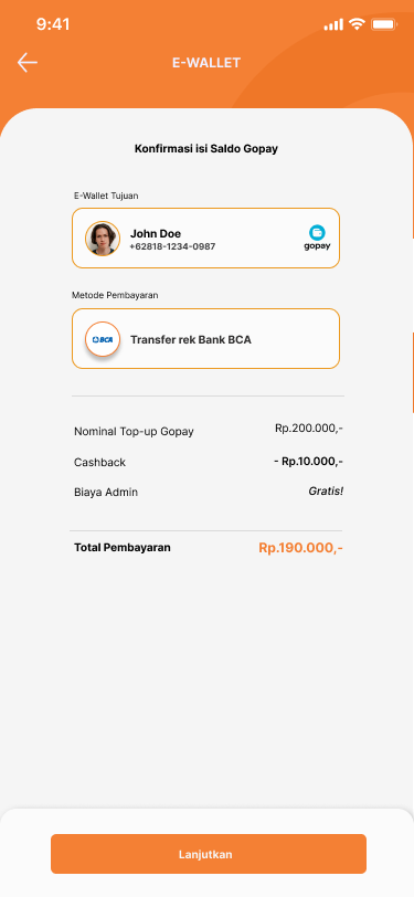
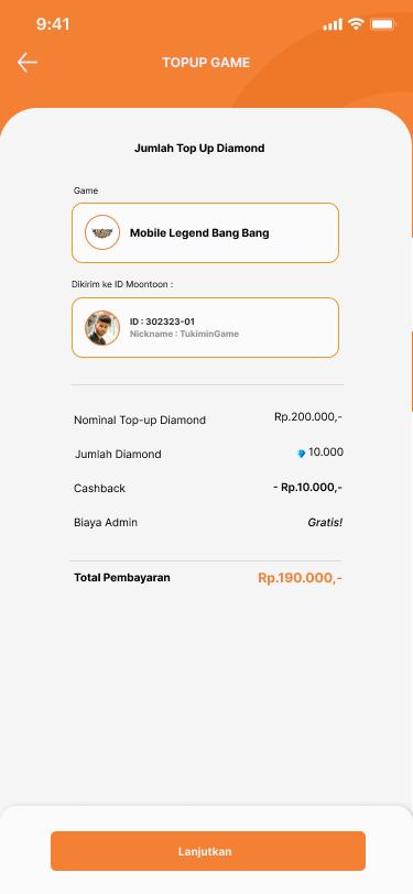
- Making fees transparent: Ensuring that fees were displayed clearly and users understood all costs before finalizing their transactions.
Defining Design Elements
- Typography: I chose a clean, sans-serif font to ensure readability, especially for users who may not be tech-savvy.
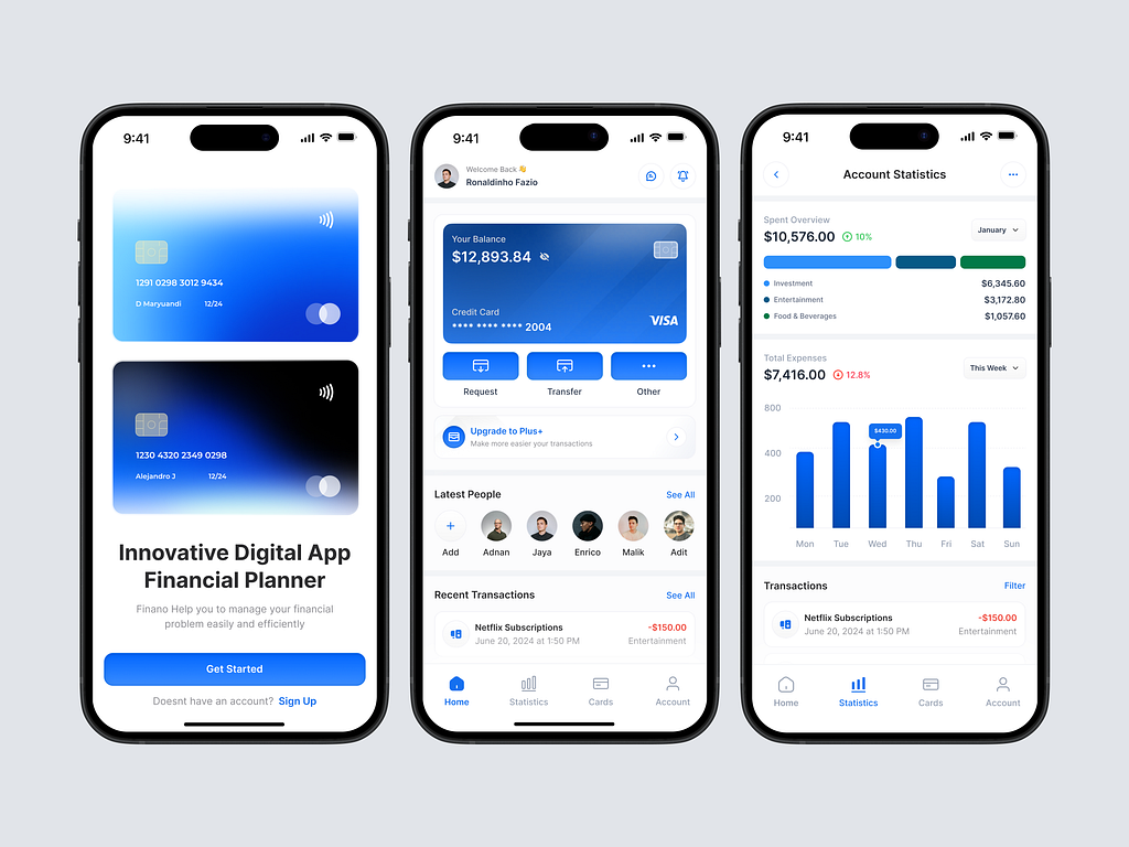
- Color Scheme: The app uses a combination of blue (representing trust and reliability) and white for a modern, minimal look. Accent colors (green for success, red for errors) were applied to give immediate feedback to users.
- Buttons & Icons: Large, easy-to-press buttons were used, with clear icons that visually represent each action. This design choice was made to accommodate a wide range of users, including those less familiar with mobile apps.

Wireframe
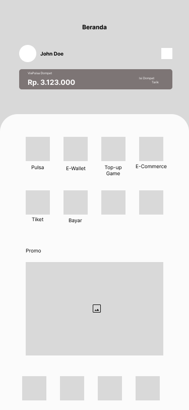
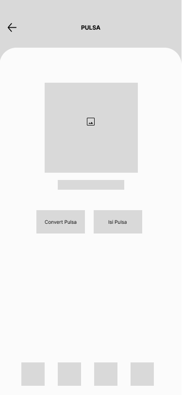
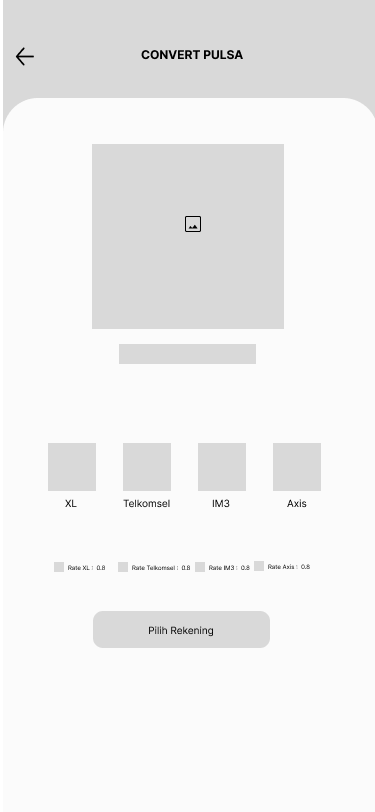
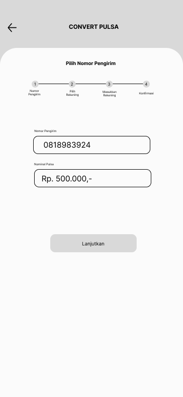
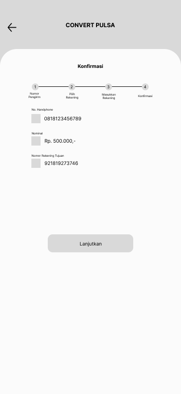
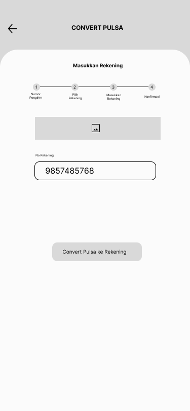
The wireframe depicted the following:
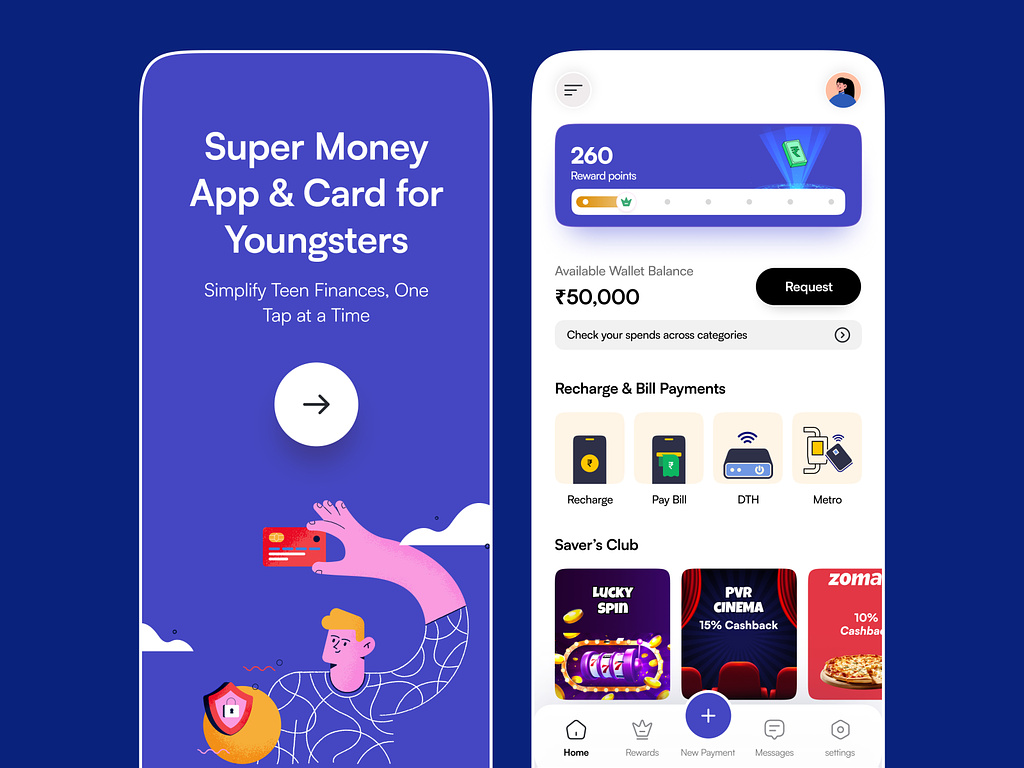
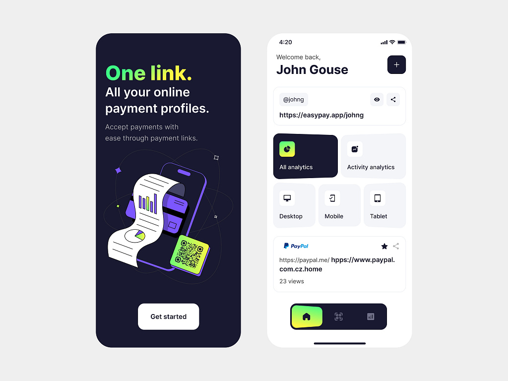
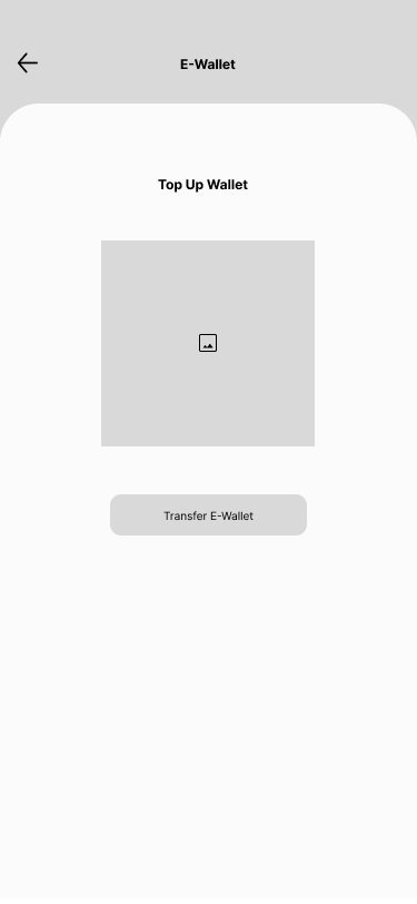
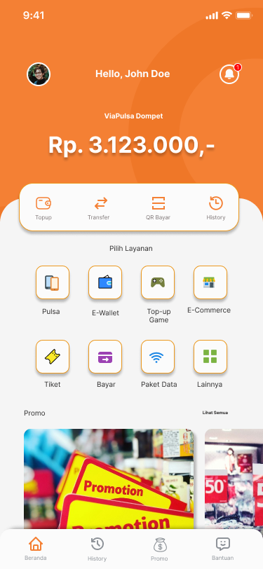
- Home Screen: Simple, with large buttons for “Mobile Credit” and “E-Wallet Top-Up,” accompanied by a small menu bar for transaction history and settings.
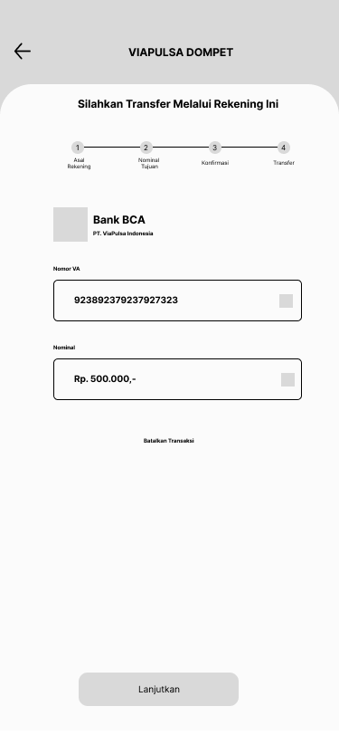
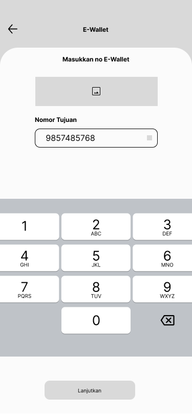
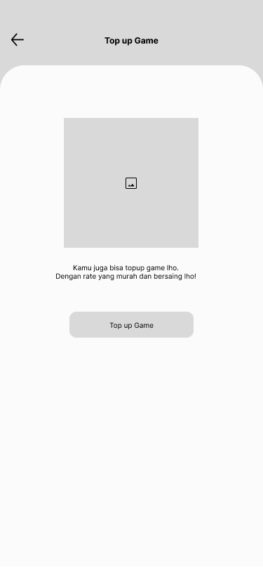
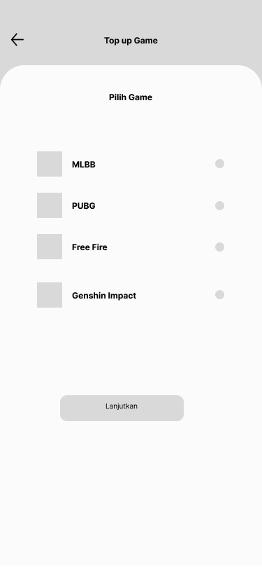
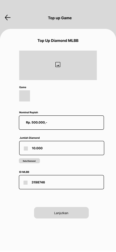
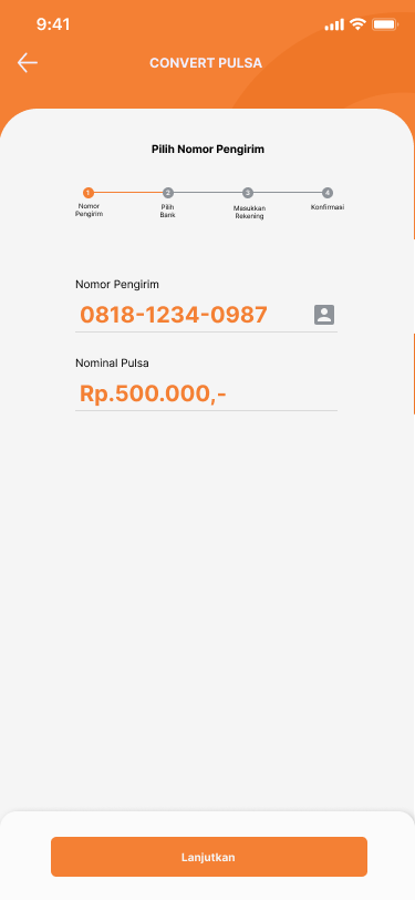
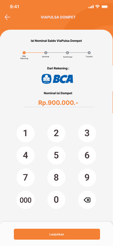
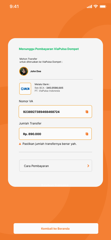
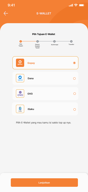
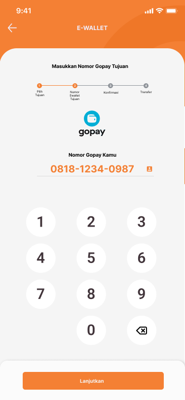
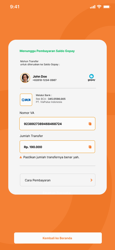
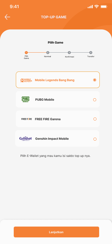
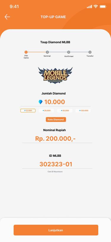
- Top-Up Flow: A step-by-step flow with a clear structure for selecting amounts, confirming details, and choosing a payment method.
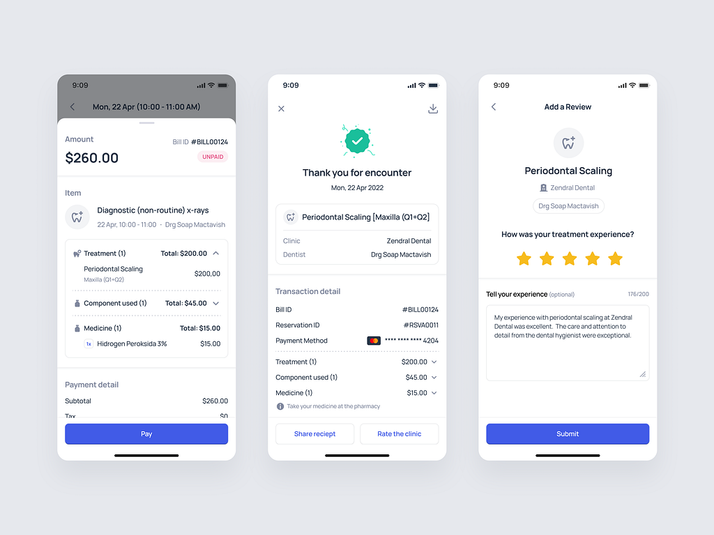
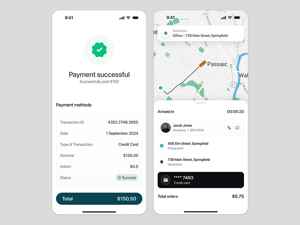
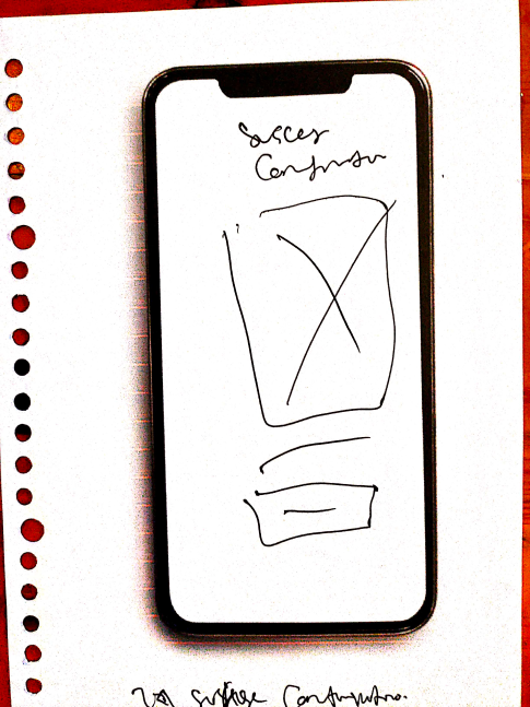
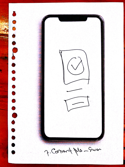
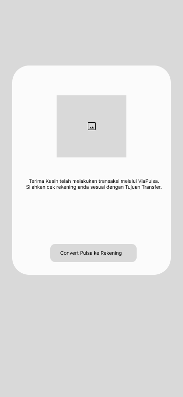
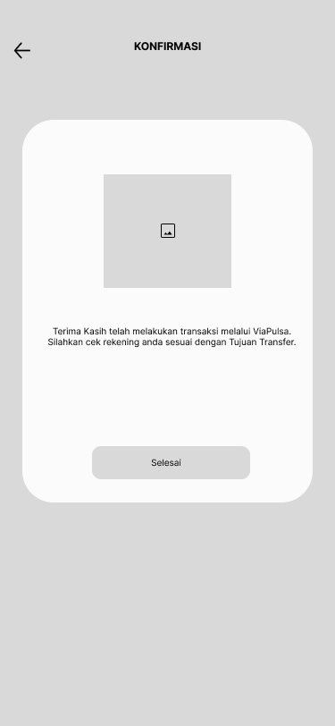
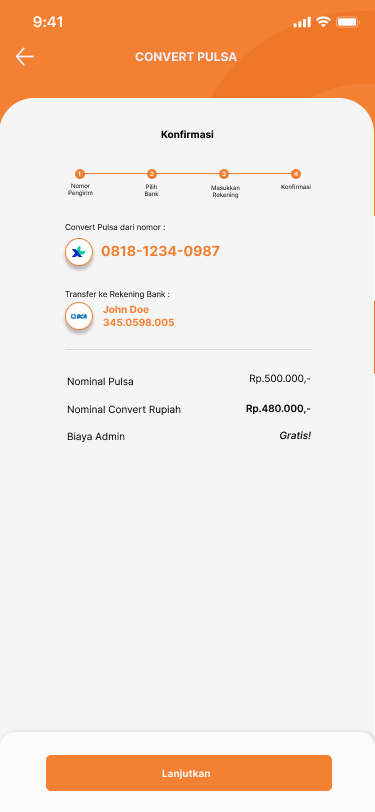
- Payment Confirmation: A screen summarizing the transaction with detailed cost breakdowns before final confirmation.
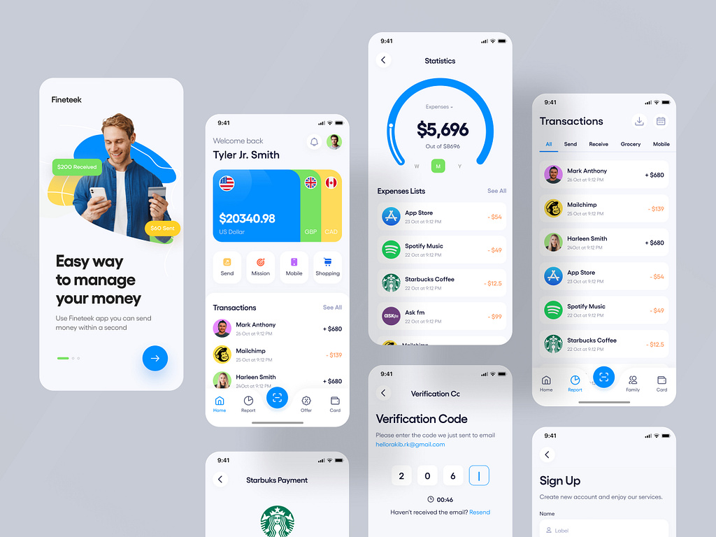
- Transaction History: A list of previous transactions, with status indicators showing whether the transactions were successful or pending.
Mockup
The mockups reflected the finalized visual design of the app:
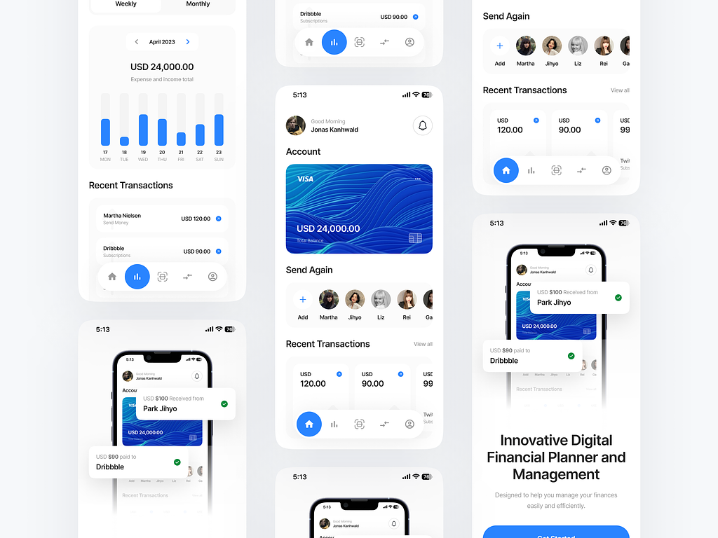
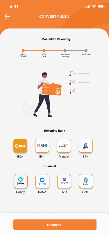
- Home Screen: A clean layout with two large buttons for “Mobile Credit” and “E-Wallet Top-Up” options, along with a quick access link to transaction history.
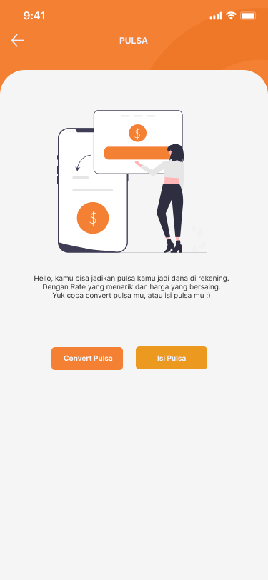
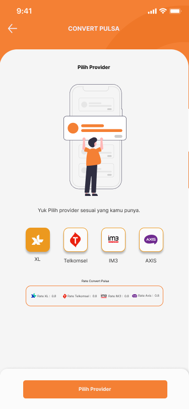
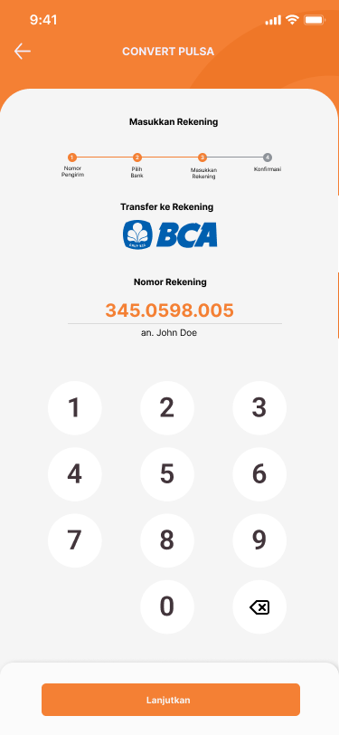
- Top-Up Flow: A minimal, step-by-step process with clear instructions at each stage.
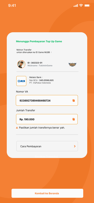
- Payment Screen: A clear and detailed payment summary before transaction confirmation.
- Profile/Settings: Easy access to profile management and stored payment methods.
Design Decisions
- Simplicity over complexity: The primary design decision was to create a minimal user interface that allowed users to quickly complete their tasks without extra distractions.
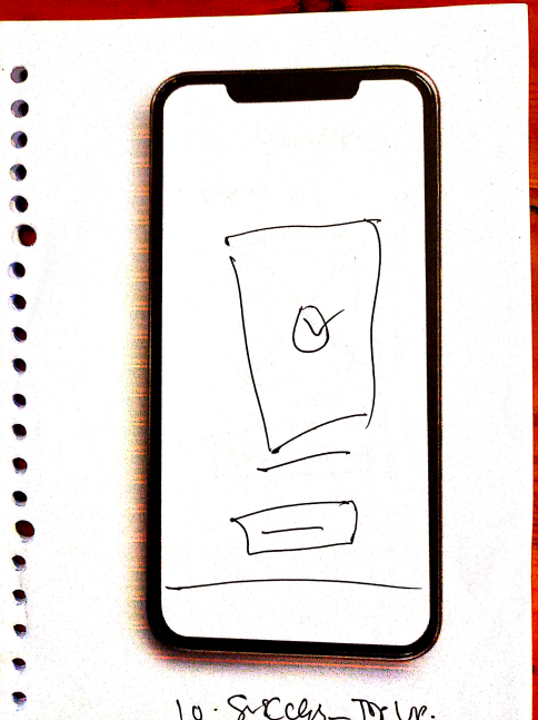
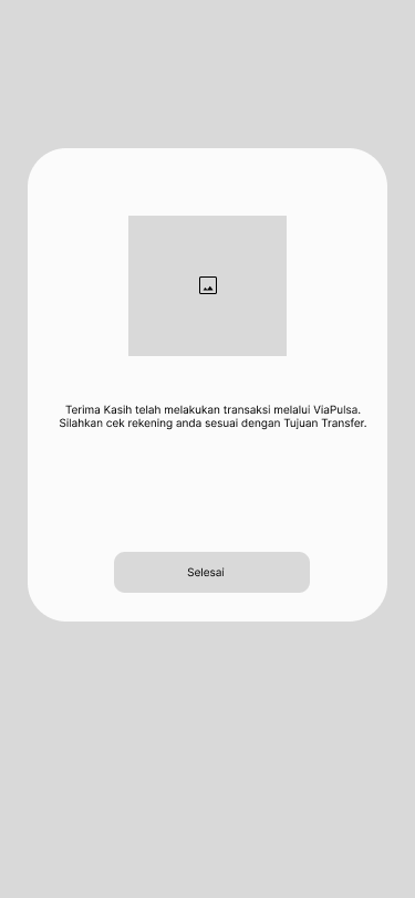
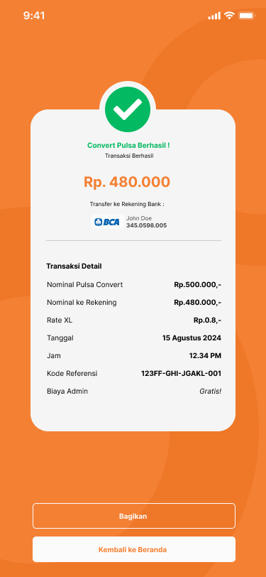
- Clear feedback: The app uses simple feedback systems (success and error messages) to guide users through the top-up process, ensuring they are always informed of the transaction status.
- Personalization: Users can save frequently used numbers and payment methods, which appear as quick-access options for returning users, enhancing the overall experience.

Result
The final product provided a simple and efficient solution for users needing to top-up mobile credit or e-wallets:
- Improved user satisfaction: Feedback indicated that users appreciated the app’s simplicity and the ease of completing transactions.
- Faster transaction completion: The streamlined process reduced the number of steps, allowing users to top-up in just a few clicks.
- Increased engagement: The clear, transparent display of fees and the ability to save frequently used numbers led to higher user retention and engagement.
Ending
This UI/UX case study showcases how a focus on simplifying complex processes and enhancing transparency can create a better user experience for mobile credit and e-wallet top-up services.
Are you ready to dive deeper and discover more of our exciting projects filled with creativity?
