Overview
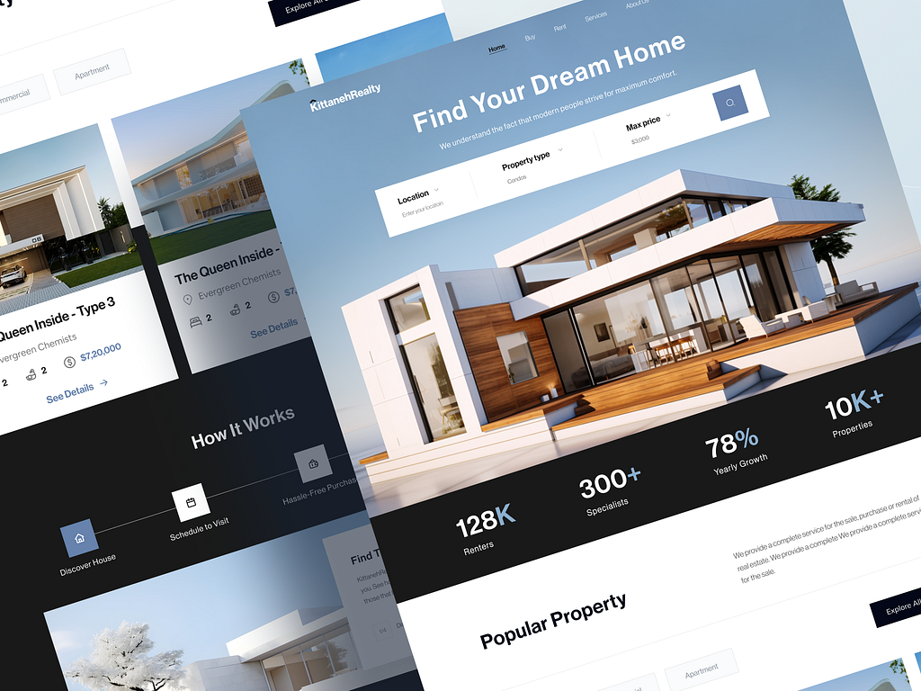
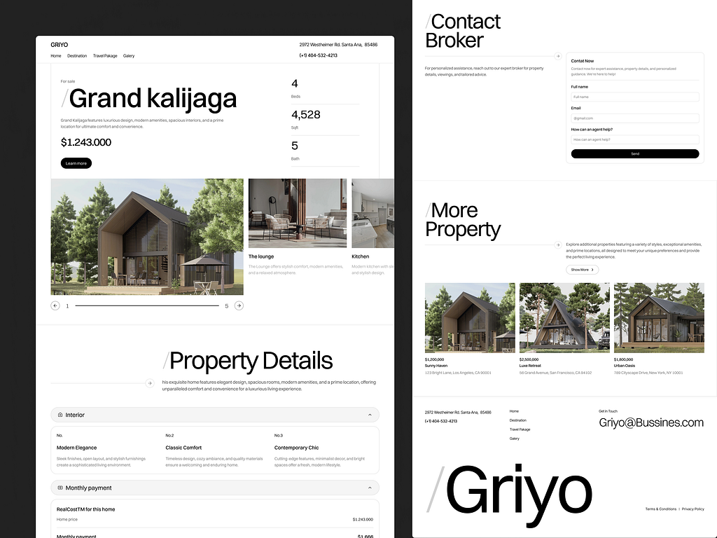
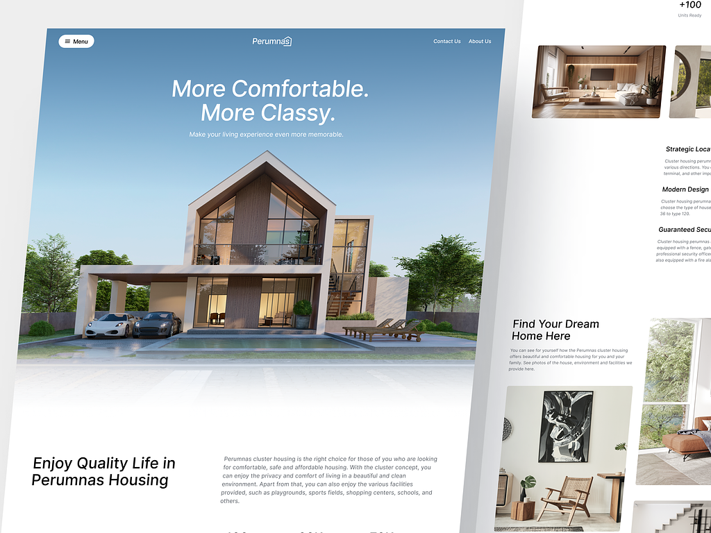
The Mataram City Landing Page website is a digital platform created to promote and showcase a residential and commercial property complex located in Yogyakarta. The primary goal of the landing page is to engage and inform potential buyers, investors, and tenants by highlighting the modern lifestyle, amenities, and investment opportunities offered by Mataram City. The website is designed to convert visitors into leads through easy-to-use contact forms, booking options for site visits, and comprehensive information about the property.
Goals
The objectives of the landing page include:
- Attracting buyers and investors: Provide visually compelling and detailed content to appeal to both homebuyers and real estate investors.
- Generating leads: Enable visitors to easily submit inquiries, schedule site visits, and request detailed property information.
- Highlighting amenities and lifestyle: Showcase the residential and commercial features, amenities, and the overall lifestyle that Mataram City offers.
- Optimizing for conversion: Design the layout and user flow to drive engagement and lead generation.
The User & Audience
The primary users and audience for the Mataram City Landing Page are:
- Homebuyers: Families and individuals looking for modern living spaces in Yogyakarta with good access to amenities.
- Real estate investors: People interested in purchasing property as an investment, particularly in a growing urban area like Yogyakarta.
- Business owners: Entrepreneurs or retail businesses searching for commercial spaces to lease or purchase within the complex.
- Real estate agents: Agents looking for attractive properties to recommend to clients interested in both residential and commercial spaces.
Role & Responsibility
As the UI/UX Designer for this project, my responsibilities included:
- User research: Conducting research to understand the motivations and preferences of potential buyers, investors, and business owners.
- Wireframing: Creating the structural wireframes to outline key sections of the landing page, including property highlights, amenities, and lead generation forms.
- UI design: Developing a visually appealing, modern interface that represents the elegance and modernity of Mataram City.
- Prototyping: Building interactive prototypes to simulate the user experience and flow of the landing page.
- User testing: Testing the page with sample users to ensure it is engaging, easy to navigate, and effective in generating leads.
- Collaborating with developers: Working closely with developers to ensure the design translates well into a fully functional website and performs smoothly across devices.
Tools Design
- Figma: For wireframing, creating prototypes, and designing high-fidelity mockups.
- Adobe XD: Used for initial prototypes and interactive testing.
- InVision: For collaborative review and design handoff to developers.
- Sketch: Early design drafts and layout sketches.
- Hotjar: For tracking user interactions and understanding how visitors engage with the site.
Scope
The scope of the project covered:
- Homepage design: Introducing Mataram City with engaging visuals and key messages about the property and location in Yogyakarta.
- Property listings: Displaying available residential and commercial units with detailed descriptions and visuals.
- Lead generation forms: Designing forms for users to request information, book site visits, or contact sales teams.
- Amenities showcase: Highlighting key features such as modern facilities, green spaces, commercial areas, and proximity to important landmarks in Yogyakarta.
- Mobile optimization: Ensuring that the landing page is fully responsive and delivers a great experience on mobile devices.
Process
User Research:
- Conducted interviews with potential buyers and investors to understand what drives their decisions when considering new properties in Yogyakarta.
- Reviewed competitor websites to assess best practices in real estate promotion and identified areas for improvement.
Sketching:
- Drafted initial sketches focusing on the layout of the homepage, including the hero section, property features, and key call-to-action buttons.
- Early sketches explored different arrangements for visual content, focusing on optimizing conversion rates by placing lead generation forms strategically.
Wireframing:
- Created detailed wireframes showing the layout of the landing page.
- The wireframes outlined sections such as the Hero Section, Available Properties, Amenities, and Lead Forms.
- Key focus areas were placed above the fold to capture user attention immediately upon landing on the page.
Prototyping:
- Developed a prototype in Figma to visualize how the landing page would function, from navigating property listings to filling out lead generation forms.
- The prototype was tested internally to check flow, responsiveness, and ease of use.
User Testing:
- Usability tests were conducted with potential homebuyers and investors to gather feedback on the ease of navigation, the visual appeal of the design, and the clarity of property information.
- Adjustments were made based on feedback to simplify the navigation and improve the clarity of lead generation forms.
Inspiration
Inspiration for the Mataram City Landing Page came from modern real estate websites like Zillow and Realtor.com, with a focus on clarity, large visuals, and an intuitive flow. The key was to create a landing page that felt professional and sophisticated, reflecting the quality of Mataram City itself.
The lifestyle-based design approach was inspired by travel and lifestyle websites, emphasizing the experience of living in Yogyakarta. Incorporating visuals of amenities such as parks, cafes, and shopping areas was aimed at selling not just the property, but the lifestyle that comes with it.
Sketching
Initial sketches focused on:
- Hero Section: A large, full-width image showcasing Mataram City, with a clear headline and a call-to-action button (e.g., “Book a Site Visit”).
- Key Features Section: A grid layout below the fold, highlighting the amenities such as gyms, pools, parks, and proximity to schools or malls.
- Property Listings: A section showing thumbnail images of available units, with a quick preview option to view more details or schedule a visit.
- Contact Section: A simple form at the bottom for users to submit inquiries or requests for further information.
Wireframe
The wireframes laid out the following key sections:
- Hero Section: A visually engaging banner image with a headline such as “Experience Modern Living in Yogyakarta” and a Call-to-Action button to “Request More Information.”
- Property Features: A clean layout with cards representing available residential and commercial units, each featuring a small image, title, and price, along with an action button to view more.
- Amenities: A visual representation of the facilities and benefits of living in Mataram City.
- Call to Action: Lead generation forms integrated throughout the page to encourage users to schedule site visits, download brochures, or contact the sales team.
Struggle
Challenges during the design process included:
- Balancing visual aesthetics with functionality: Ensuring that the site looked attractive and modern while keeping the user flow simple enough to encourage lead generation.
- Optimizing for mobile: Making sure that the website’s responsive design worked perfectly on all devices, especially considering that many users would be viewing the site from their phones.
- Lead generation focus: Ensuring that calls to action (e.g., schedule a visit, request more information) were prominent and easy to access without feeling intrusive.
Defining Design Elements
- Typography: A modern serif typeface was chosen for headlines, combined with a clean sans-serif for body text to convey elegance and professionalism.
- Color Palette: A combination of deep greens and neutral tones was used to reflect luxury and tranquility, in line with the branding of Mataram City. Accent colors such as gold were applied to buttons and call-to-action areas to draw attention.
- Imagery: High-resolution images of the property, amenities, and Yogyakarta’s lifestyle were used to create an immersive experience for the user.
- Buttons: Large, clear, and strategically placed buttons for scheduling visits, viewing properties, and contacting sales were included throughout the page.
Mockup
The final mockup displayed:
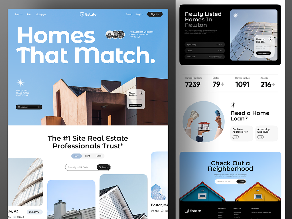
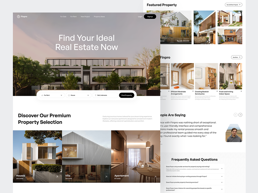
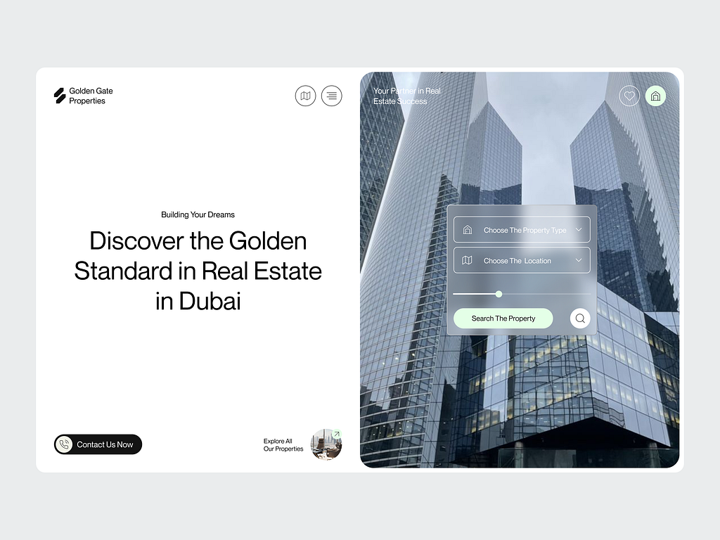
- Hero Section: A large image of Mataram City, with a call-to-action button, inviting users to schedule a visit or learn more about the property.
- Property Listings: A grid of cards showing the available residential units with prices, descriptions, and a link to view details.
- Amenities Section: A visually appealing grid showing the top amenities such as parks, gyms, cafes, and shopping centers.
- Contact Forms: Integrated forms for lead generation with clear CTAs to contact sales or request a visit.

Design Decisions
- Simple navigation: Users needed to find the property details and contact options quickly, so I opted for a top-down approach where all the key information is placed above the fold or within easy reach via scroll.
- Visual storytelling: Focused on using large, high-quality images to tell the story of the lifestyle and amenities at Mataram City, which helps attract users who are visual learners.
- Mobile-first design: With many users accessing the site via mobile devices, the design was optimized for small screens, ensuring quick load times and easy-to-click buttons.

Result
The final design for the Mataram City Landing Page resulted in:
- High engagement: The visual appeal and clear layout led to higher engagement, with more users interacting with property listings and requesting information.
- Increased lead generation: The simplified user journey, combined with well-placed CTAs, helped drive
Are you ready to dive deeper and discover more of our exciting projects filled with creativity?

