Overview
Hirefazz is an AI-powered CV analyzer SaaS (Software as a Service) designed to streamline the recruitment process by analyzing resumes and providing detailed insights into candidate qualifications. The platform enables HR professionals and recruiters to automatically assess resumes, highlighting key competencies, qualifications, and experience that match specific job requirements. The goal is to reduce manual CV screening time while improving the accuracy of candidate evaluation.
Goals
The primary objectives of the Hirefazz CV Analyzer include:
- Automating CV screening: Allow recruiters to quickly analyze resumes using AI technology.
- Improving candidate-job matching: Using advanced algorithms to highlight key skills, experience, and qualifications that are relevant to specific job descriptions.
- Enhancing efficiency: Reduce the time HR professionals spend on manual CV reviews by providing a structured summary and analysis.
- Simplifying the user experience: Providing a user-friendly platform for recruiters to upload CVs and instantly receive comprehensive analysis reports.
The User & Audience
The primary audience for Hirefazz includes:
- HR professionals: Recruiters and hiring managers who need to screen large volumes of CVs efficiently.
- Companies: Businesses looking for a tool to improve their recruitment processes by reducing the time spent on manual candidate evaluation.
- Staffing agencies: Agencies that handle multiple job applications and want to streamline their initial CV screening process.
- Hiring consultants: Independent recruiters who need a reliable tool for analyzing candidate resumes across various industries.

Role & Responsibility
As a Product Designer, my responsibilities were:
- User research: Understanding how recruiters and HR professionals interact with digital tools and identifying their pain points in CV analysis.
- Wireframing: Structuring the layout and flow of the landing page, ensuring clarity and a logical flow of information.
- UI/UX design: Designing a professional and easy-to-navigate interface that communicates the value of the platform and drives users to sign up.
- Testing and iteration: Gathering feedback from stakeholders and potential users to refine the design and increase conversion rates.
- Collaboration: Working with the development team to ensure smooth implementation of the design on the live site.
Tools Design
- Figma: Used for wireframing, high-fidelity mockups, and prototyping.
- InVision: For collaboration with stakeholders and feedback gathering.
- Miro: For brainstorming and mapping out the user journey.
- Hotjar: To track visitor behavior on the landing page and optimize design for higher engagement.
Scope
- Figma: Used for wireframing, high-fidelity mockups, and prototyping.
- InVision: For collaboration with stakeholders and feedback gathering.
- Miro: For brainstorming and mapping out the user journey.
- Hotjar: To track visitor behavior on the landing page and optimize design for higher engagement.
Process
User Research:
- Conducted interviews with HR professionals to understand what they look for in CV analysis software and what information they find most useful during the hiring process.
- Collected feedback on design expectations from potential users to determine what messaging resonates the most.
Sketching:
- Created sketches of the homepage layout to define the hierarchy of content, such as the placement of the hero section, feature highlights, testimonials, and CTAs.
Wireframing:
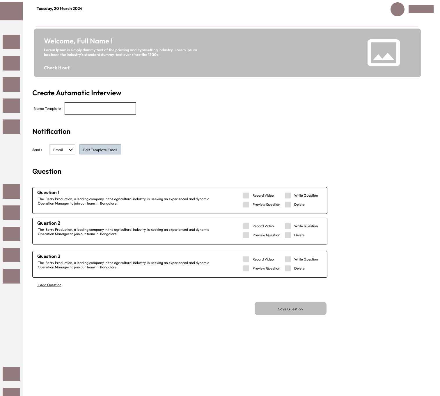
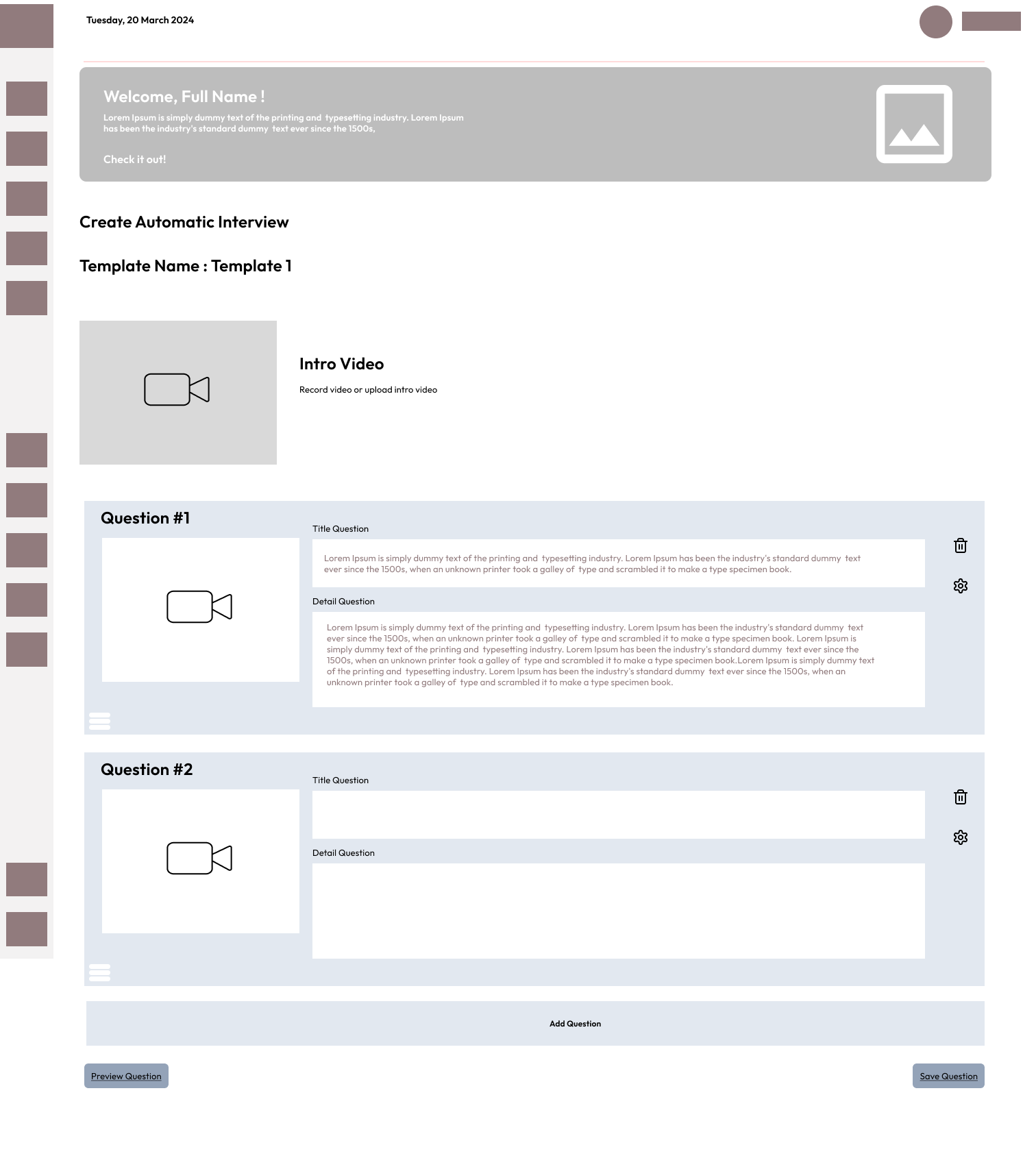
- Designed wireframes that outline the structure and navigation of the landing page.
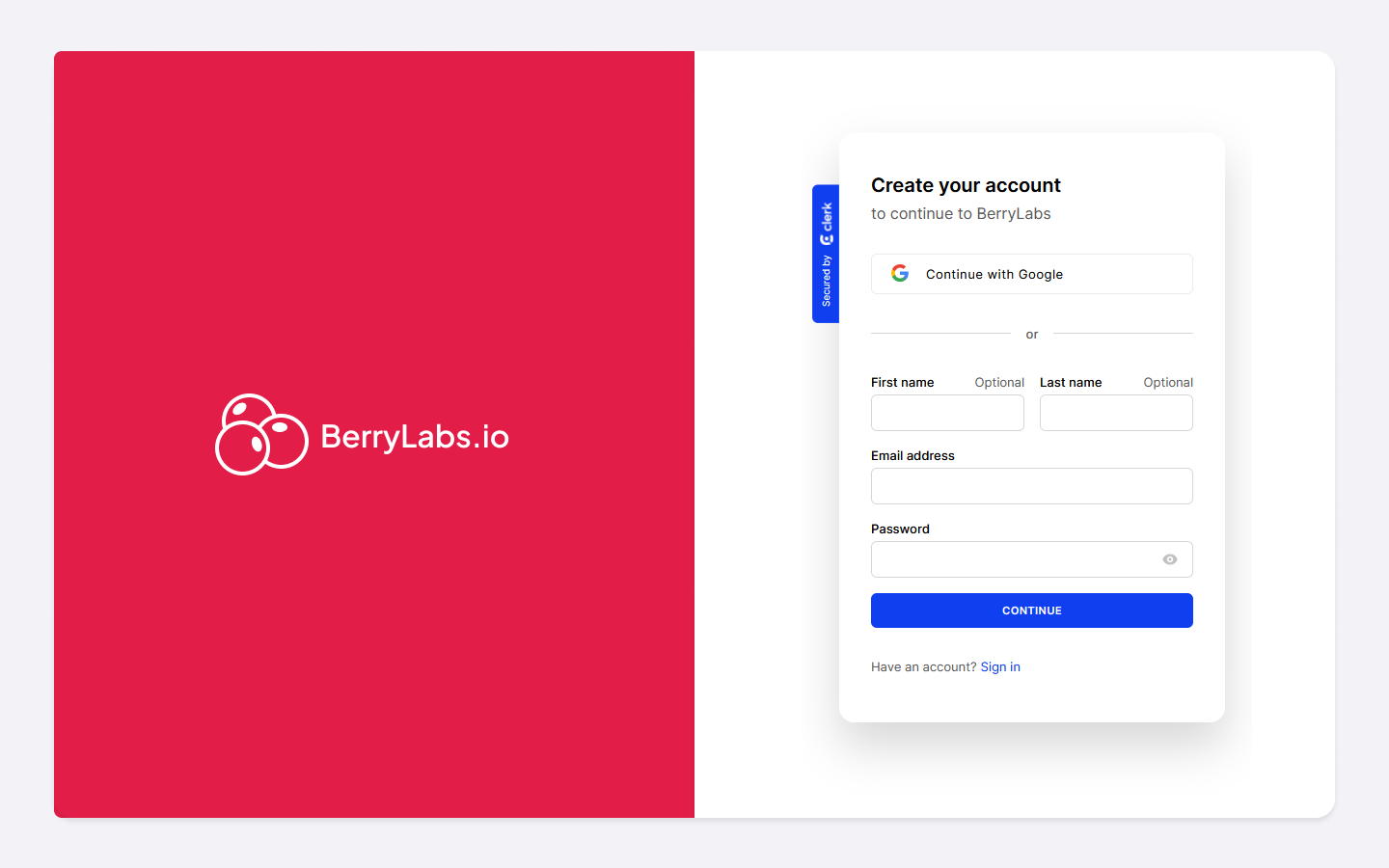
- Focused on creating a streamlined user journey from the moment they land on the page to the point where they take action (e.g., sign up for a free trial).
Prototyping:
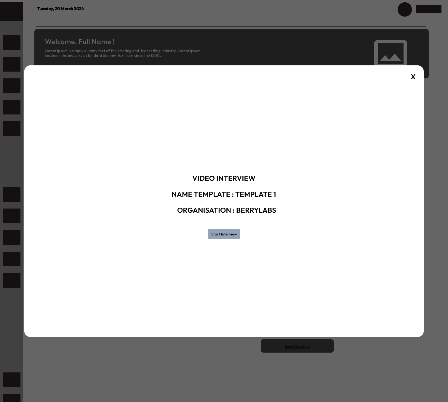
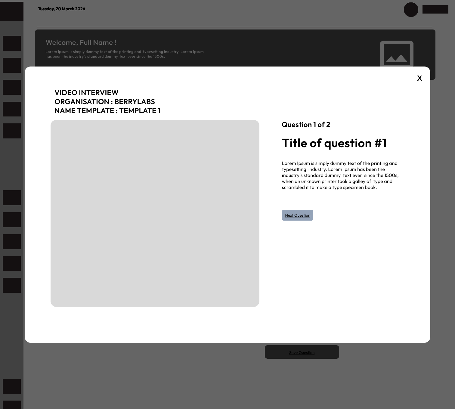
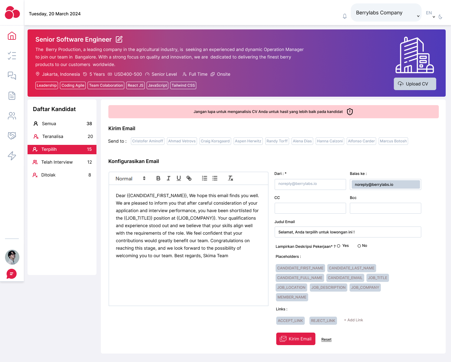
- Developed a clickable prototype that simulated interactions such as signing up for the service, uploading CVs, and viewing a sample analysis report.
- The prototype was tested internally for usability and flow.
User Testing:
- Feedback was gathered from test users to ensure that the design was intuitive and that the messaging clearly communicated the value of the product.
- Iterated on the design to address any confusion or friction points identified during testing.
Inspiration
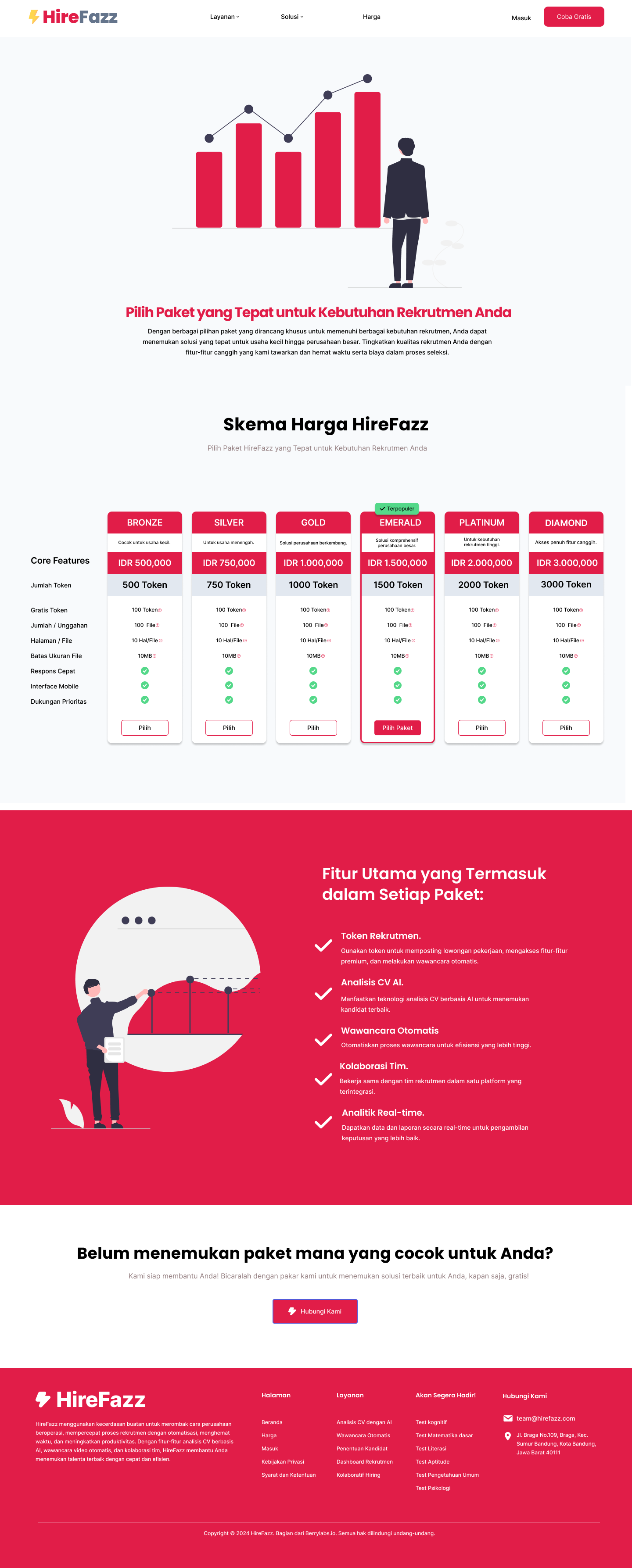
The design of Hirefazz was inspired by data-driven SaaS websites such as Grammarly and HubSpot, which focus on simplicity and easy onboarding processes. The layout was crafted to minimize distractions, drive the user to take action (e.g., sign up for a trial), and highlight the AI-powered nature of the platform. Design elements from analytics platforms like Google Analytics were also used to present complex data (like CV analysis reports) in an easily digestible format.
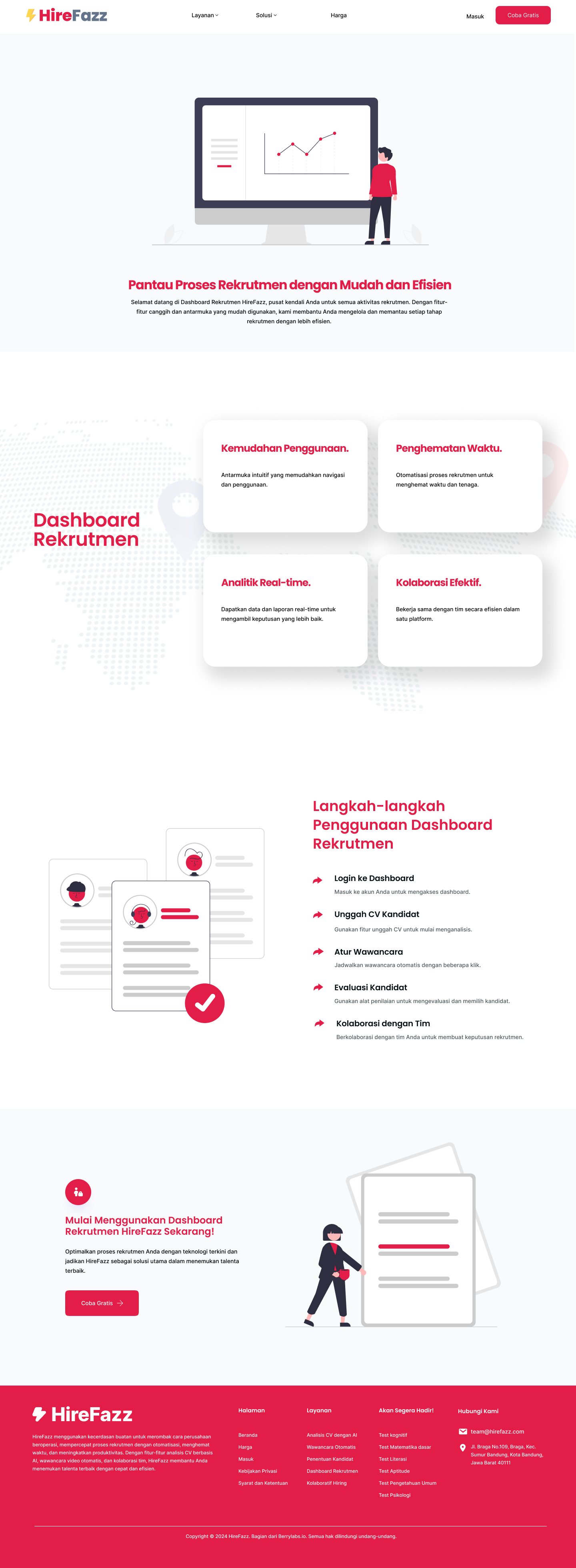
Landing Page
Initial sketches focused on the following elements:
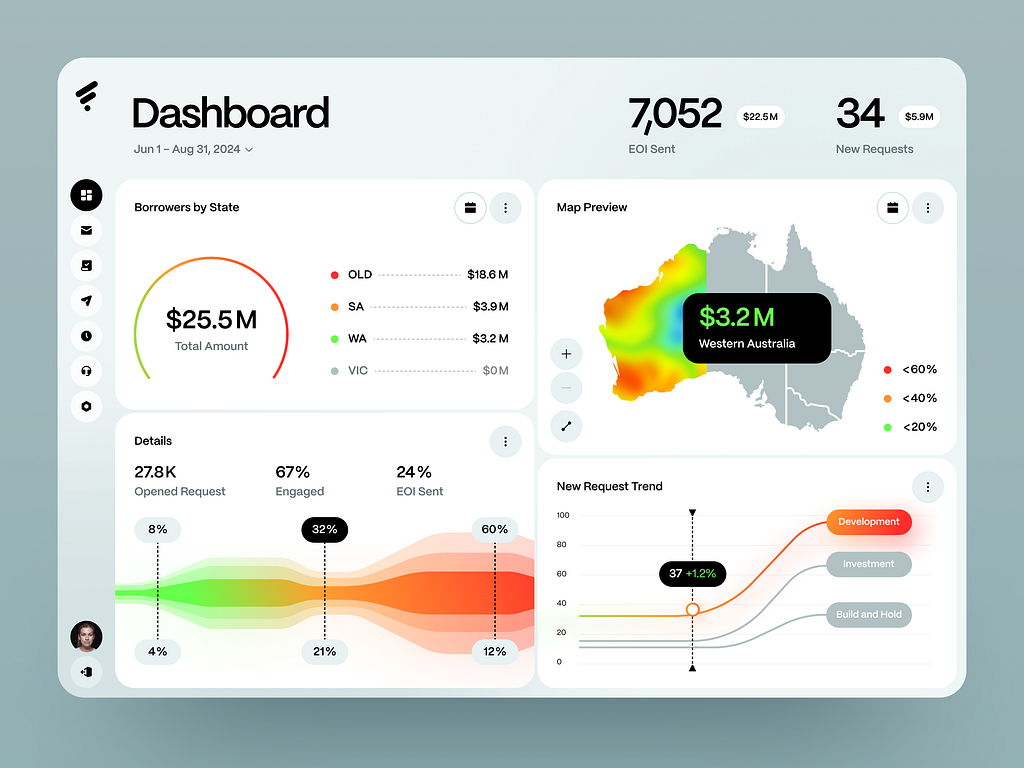
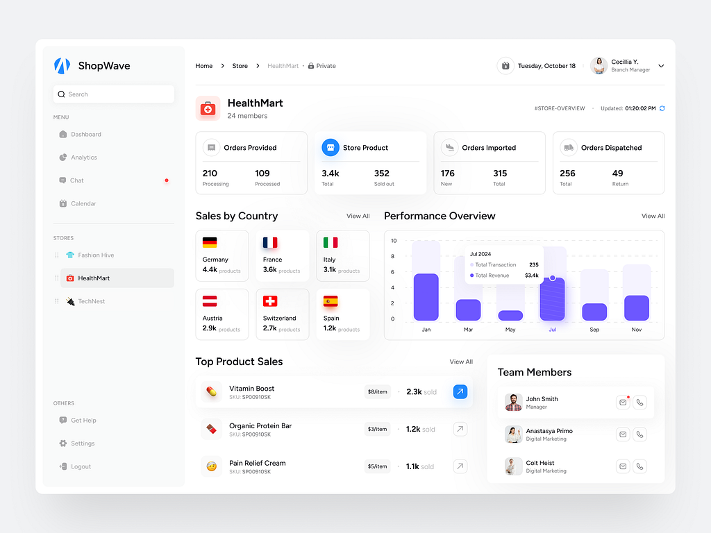
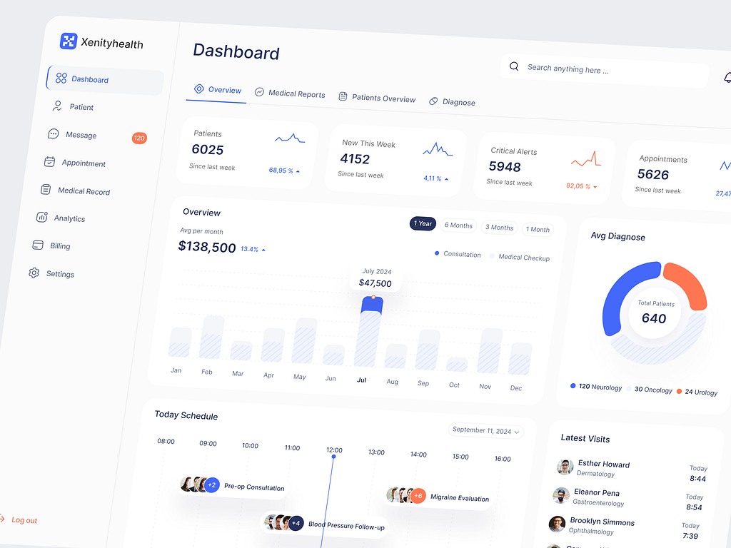
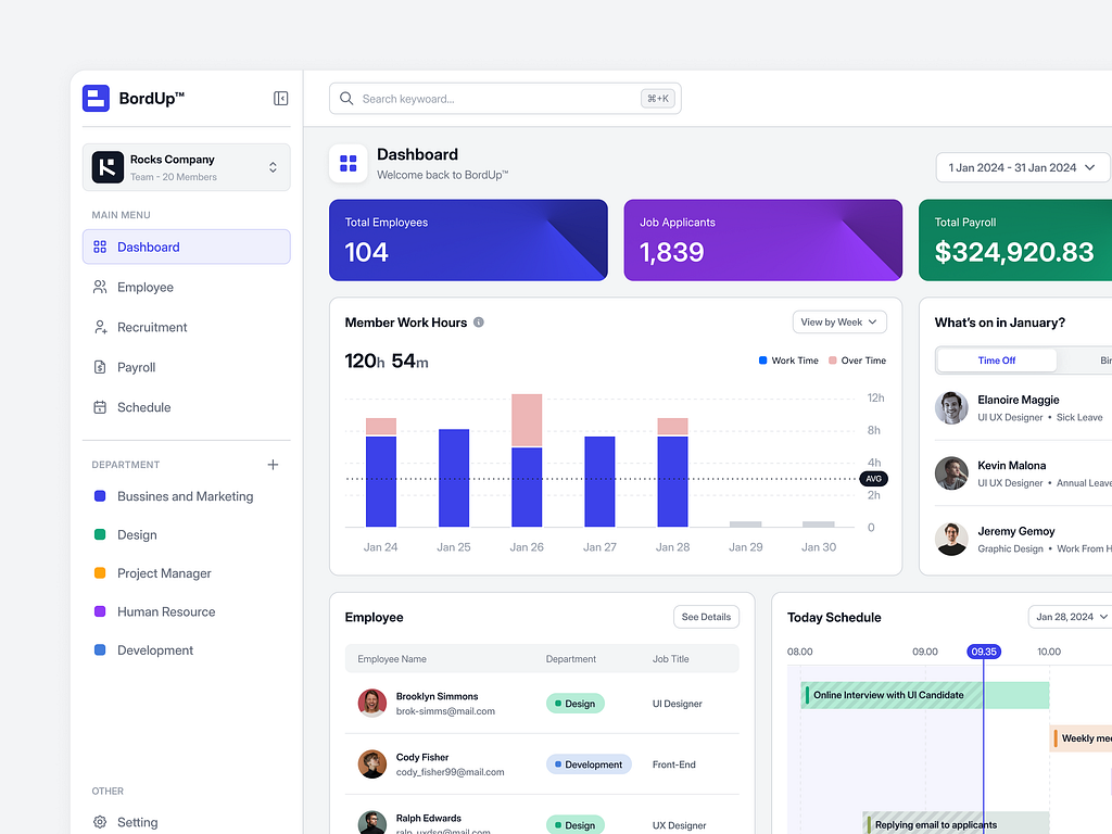
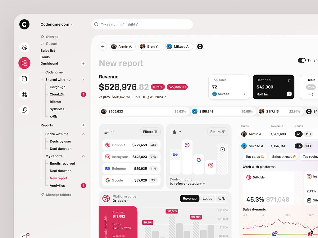
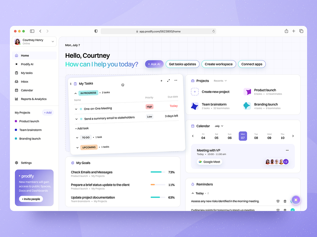
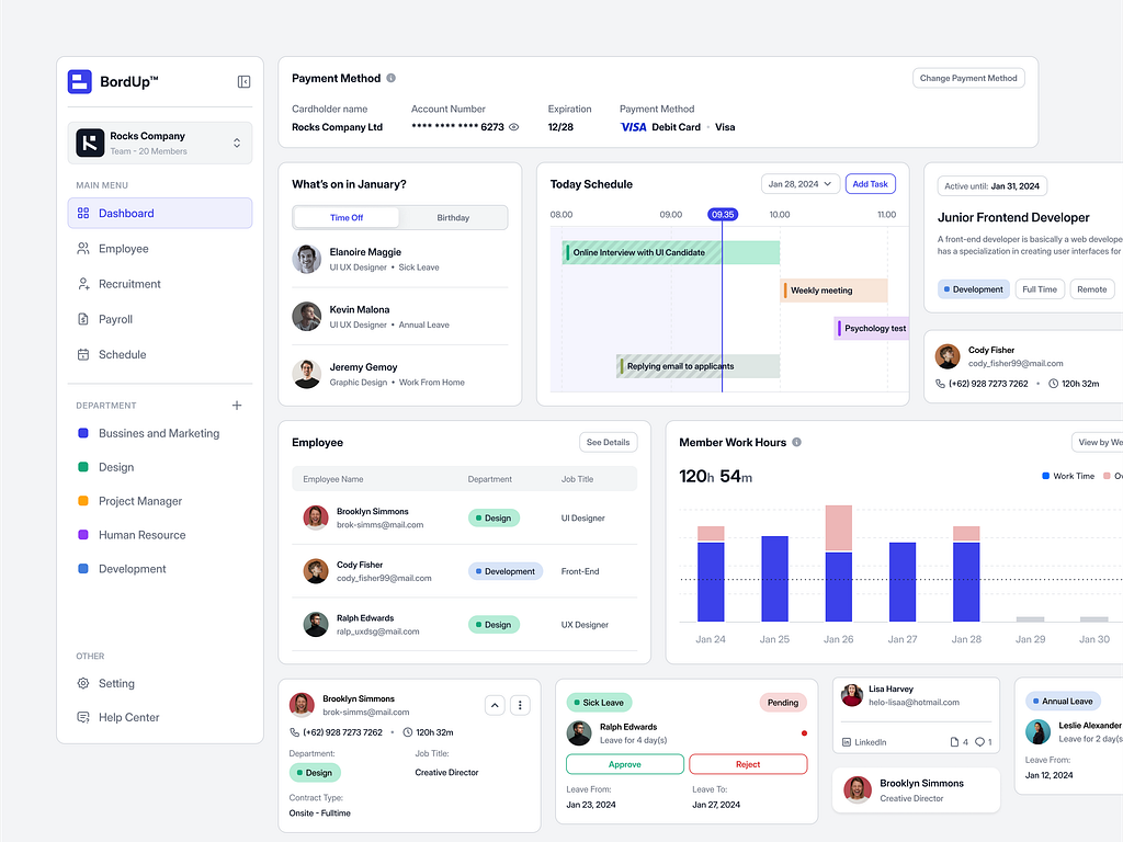
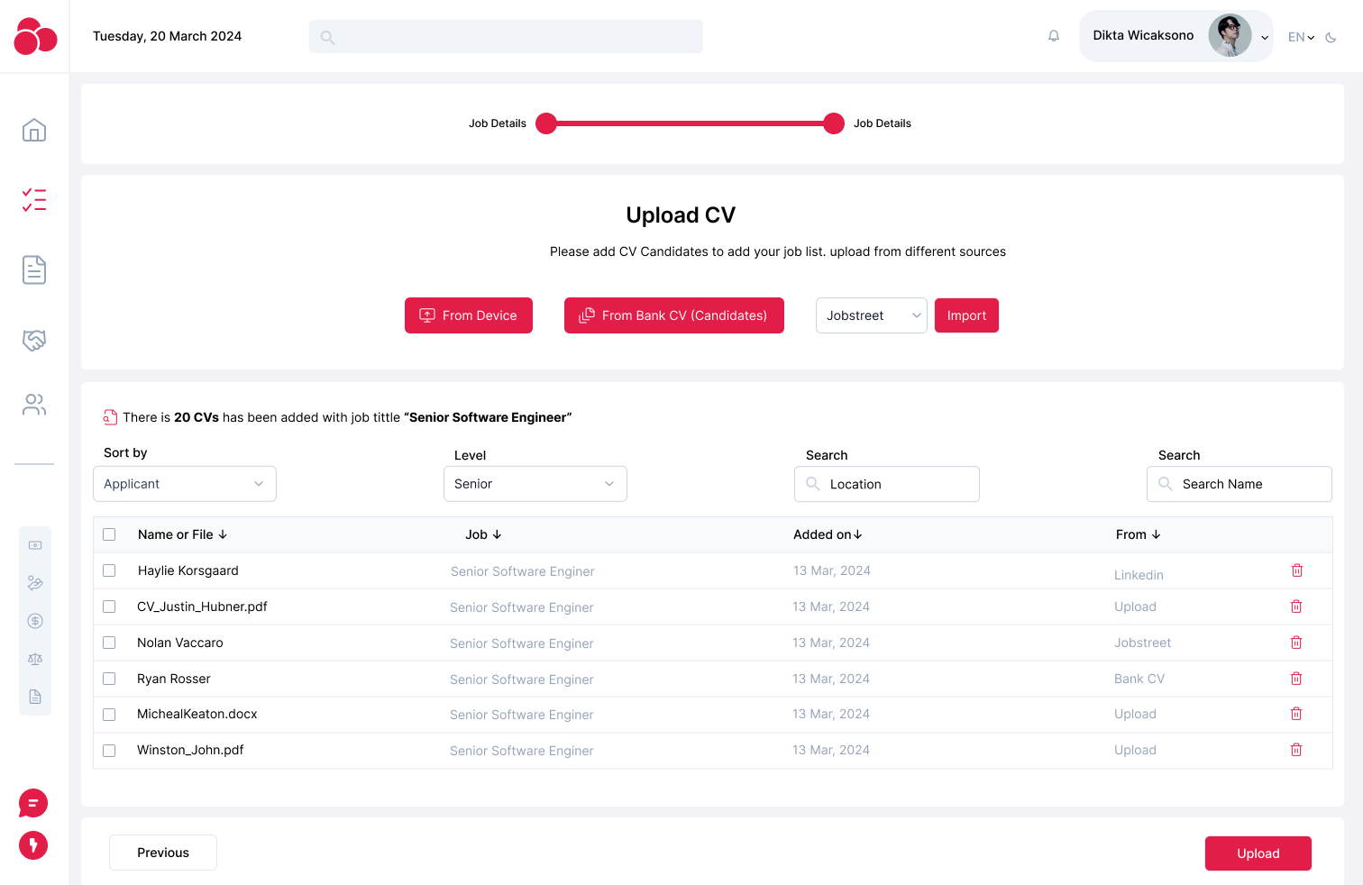
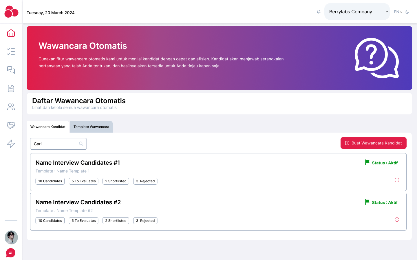
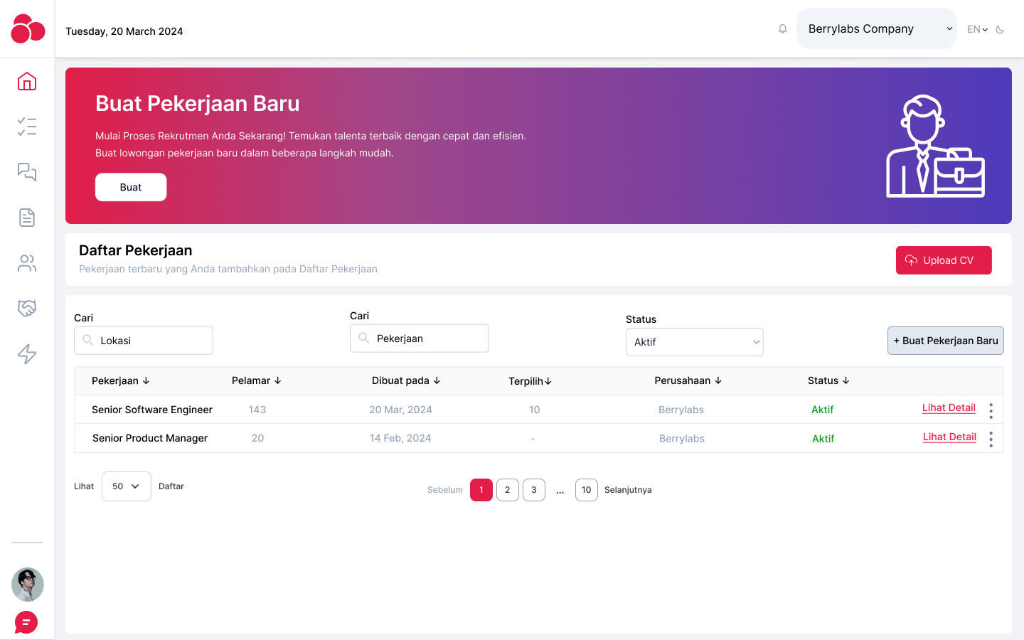
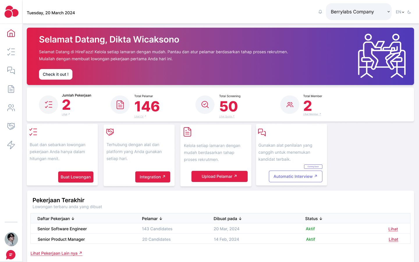
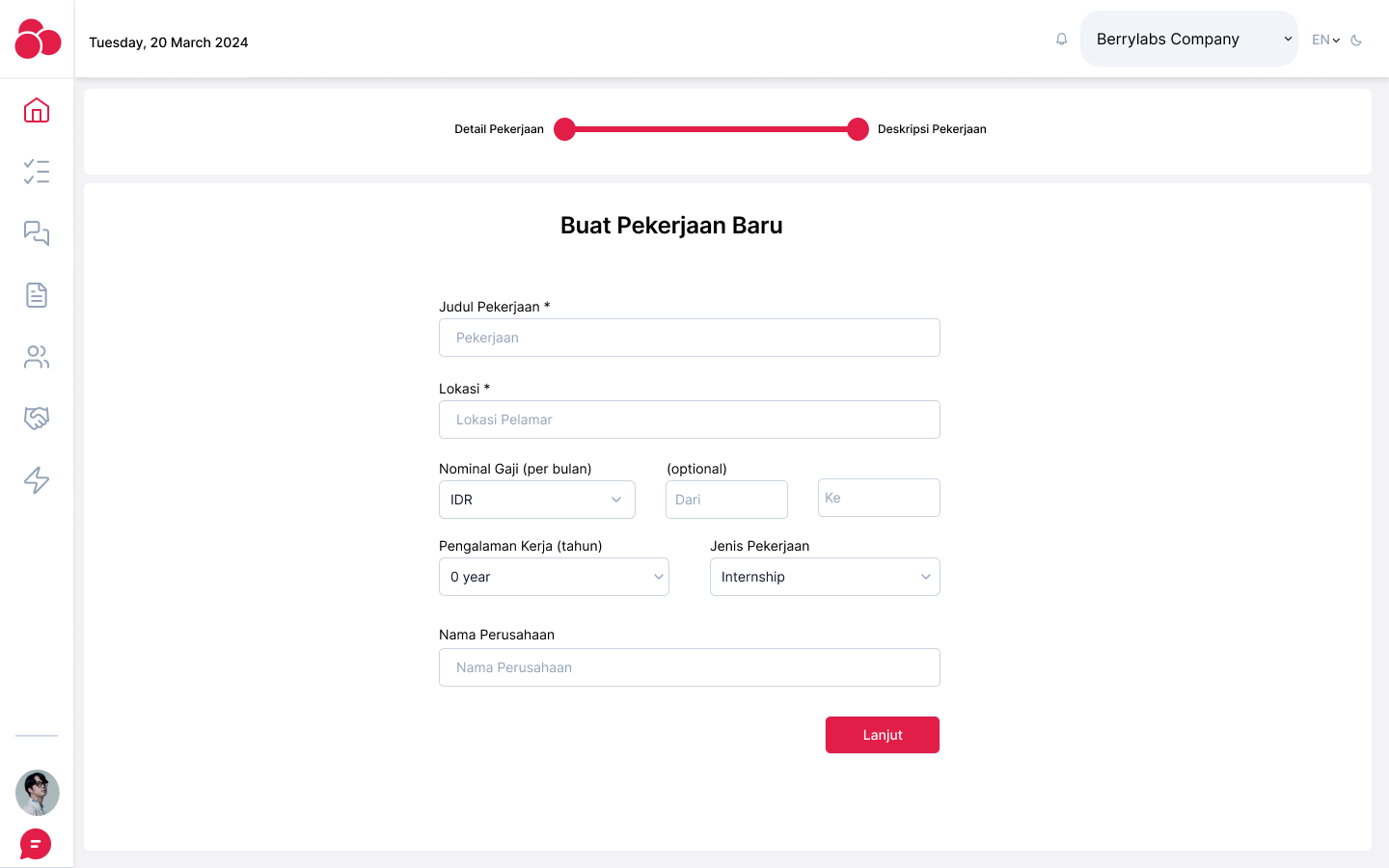
- Dashboard layout: Designed to give users an overview of their current uploaded resumes, pending analyses, and completed reports.
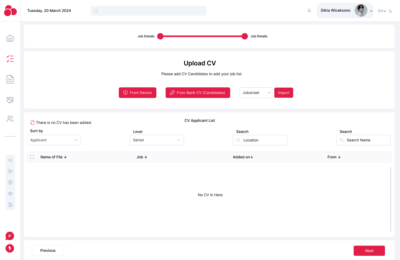
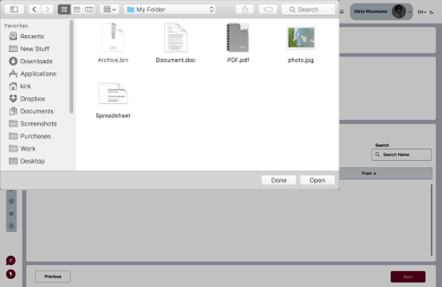
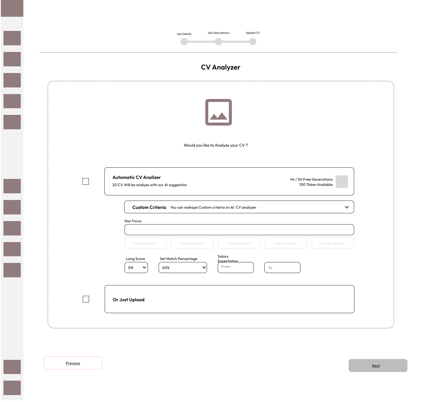
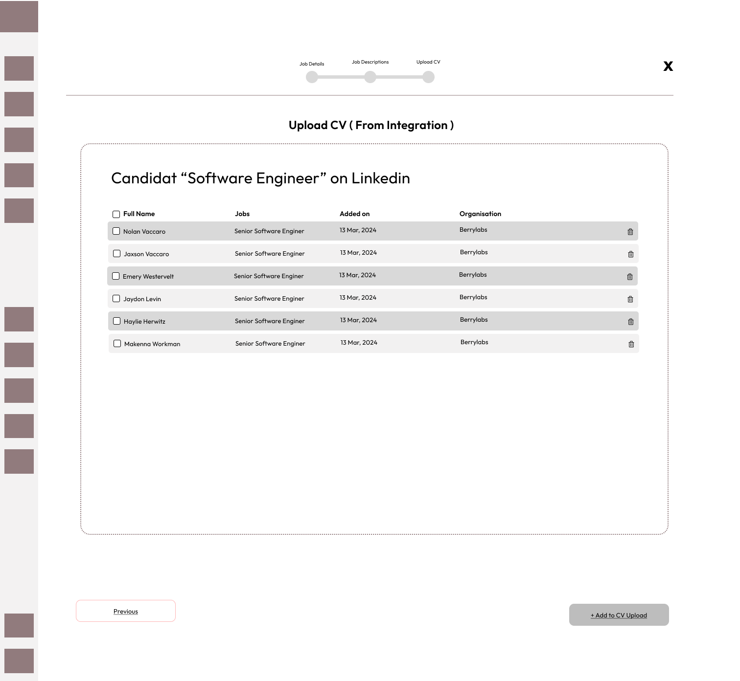
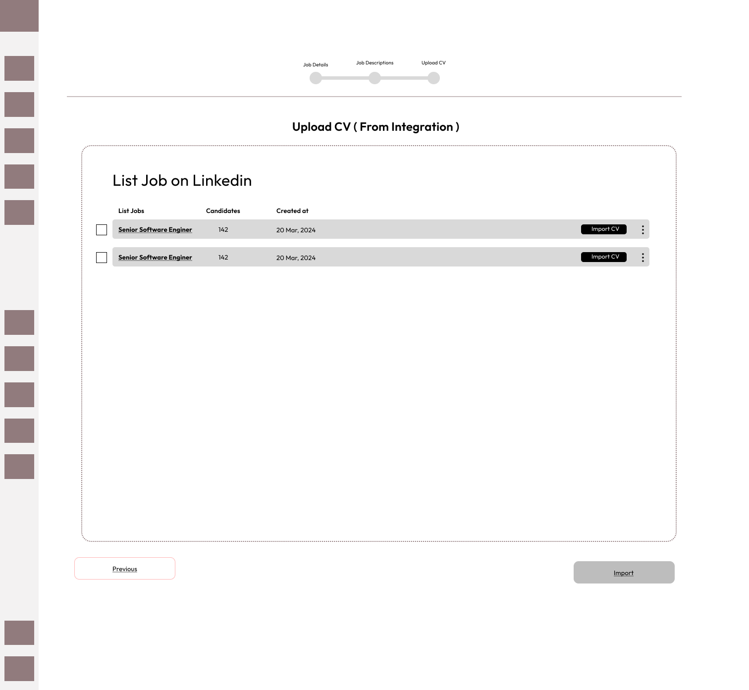
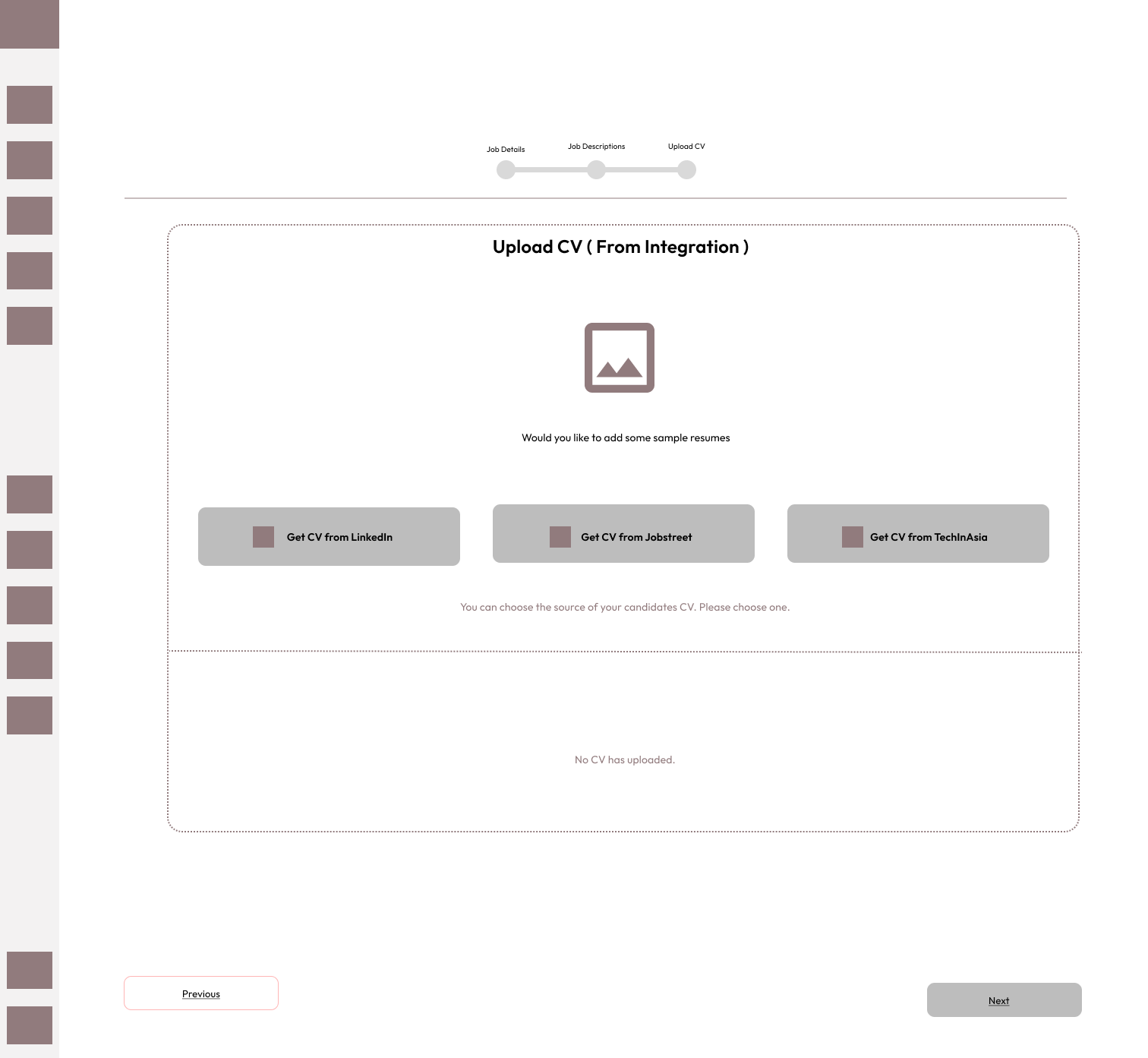
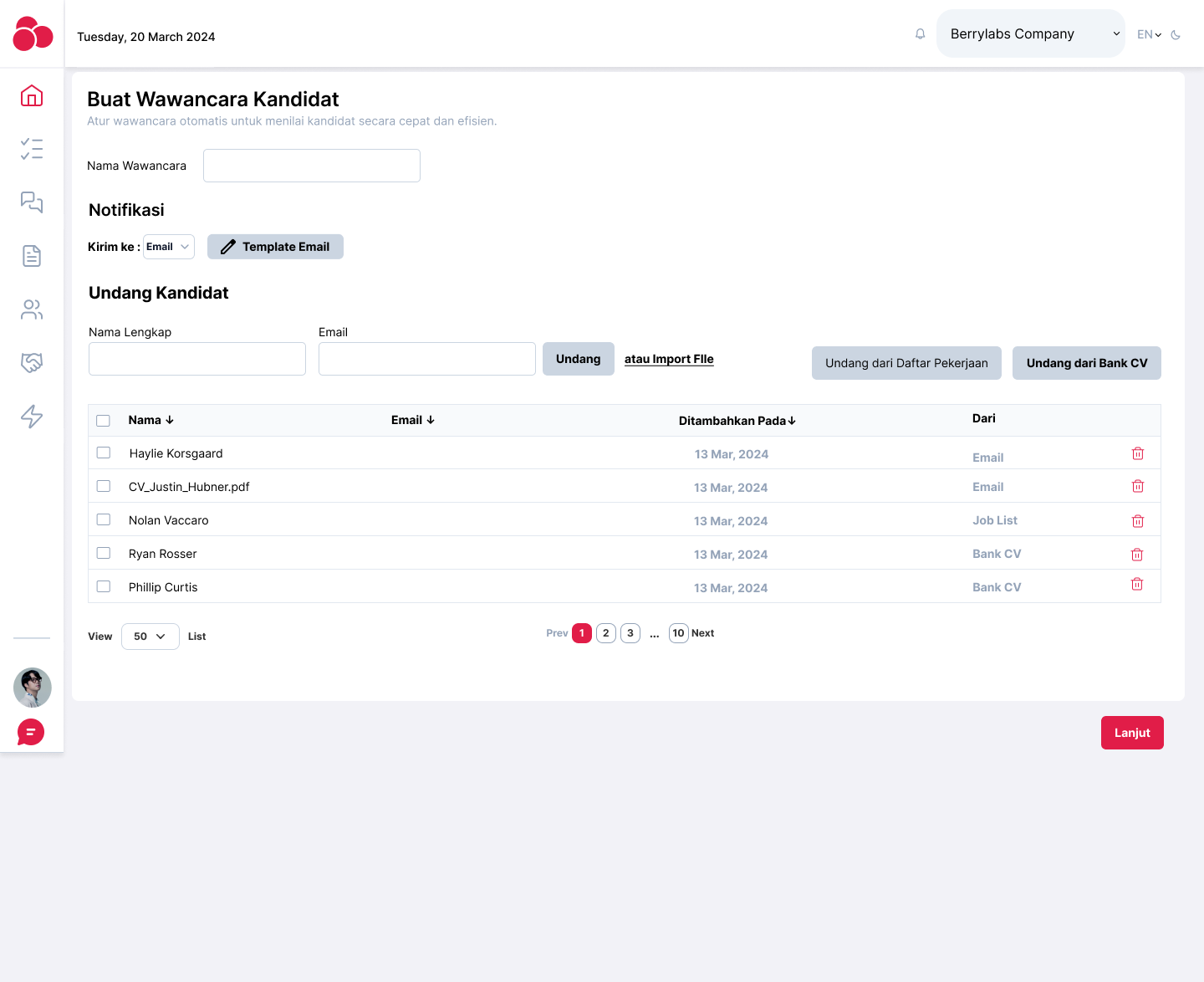
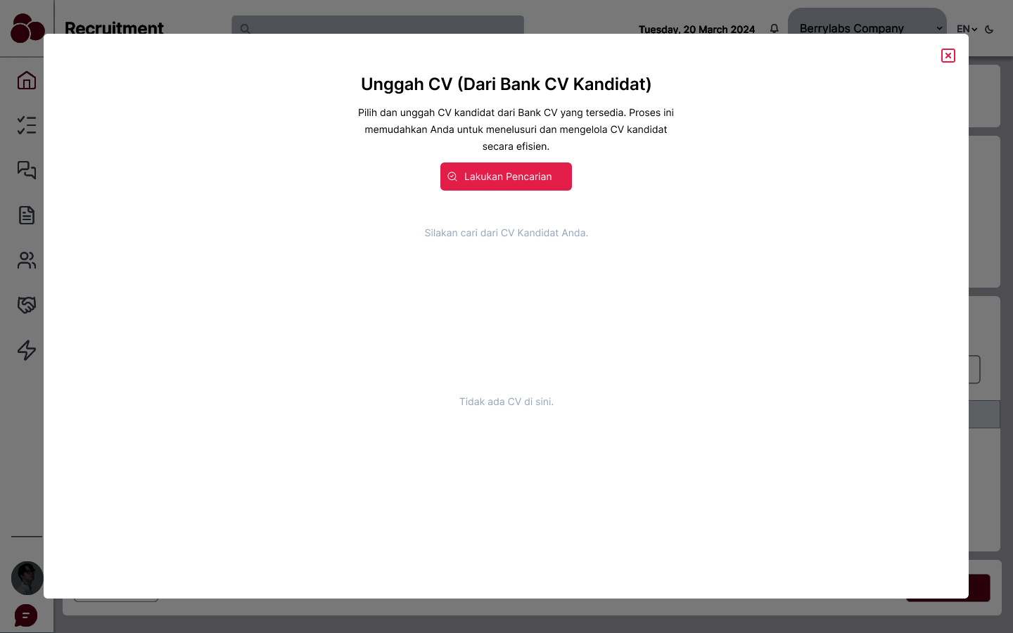
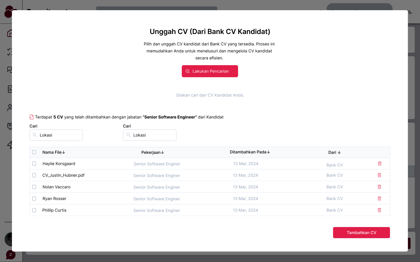
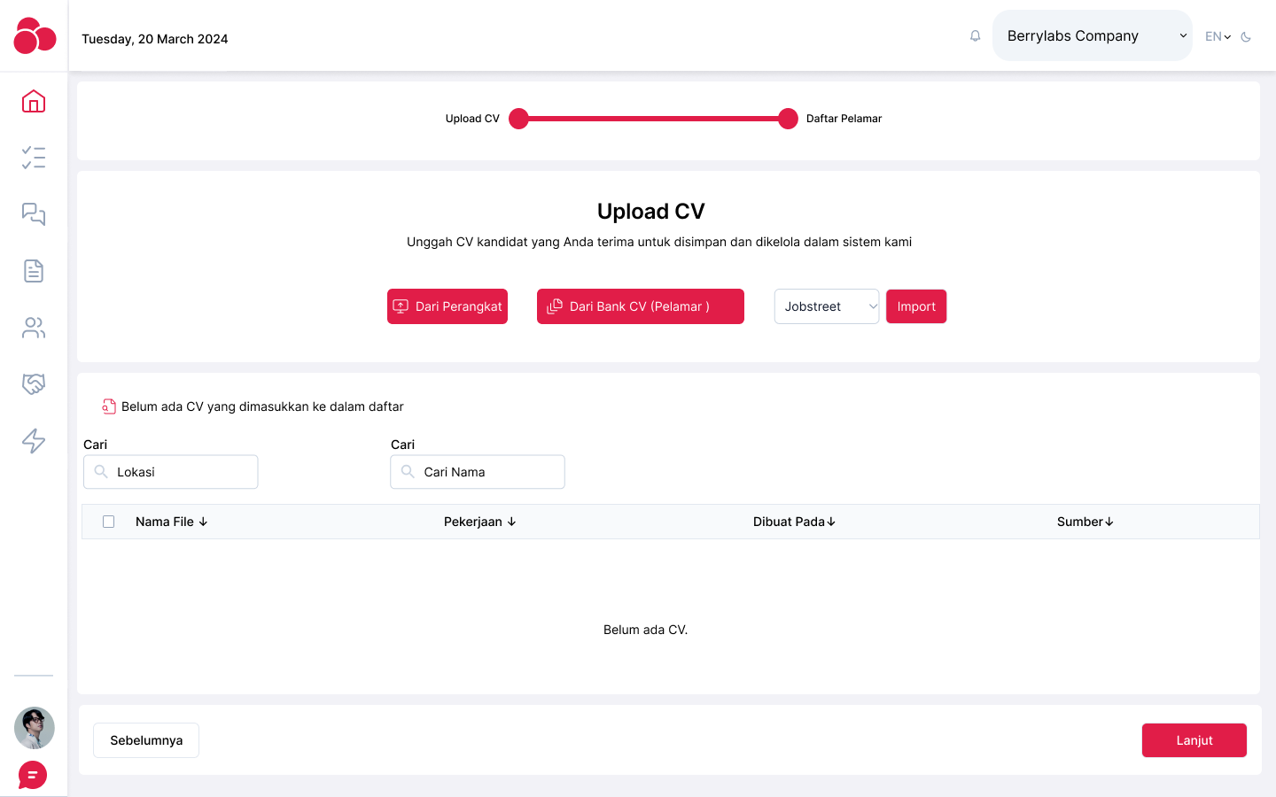
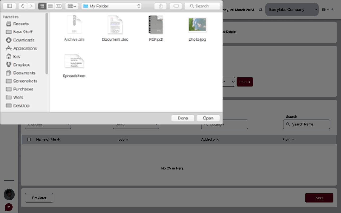
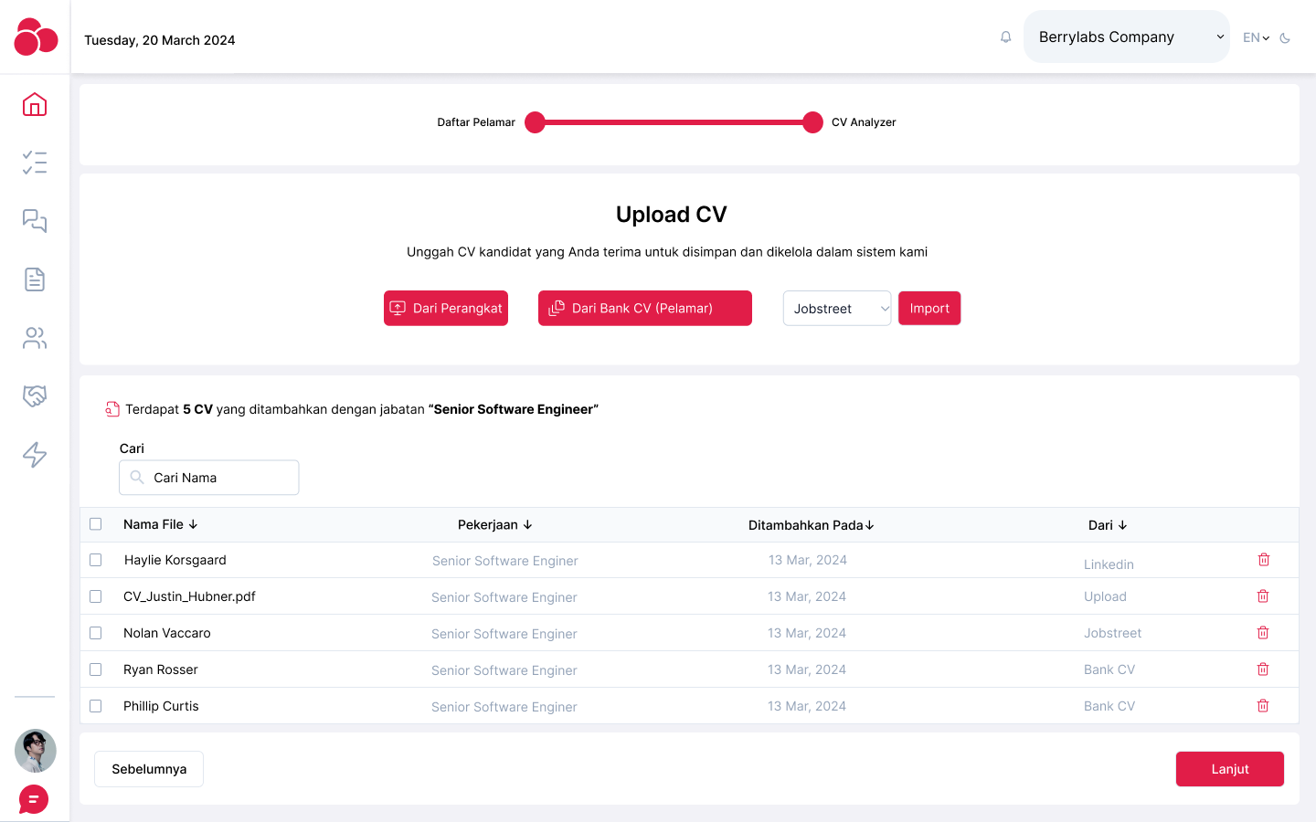
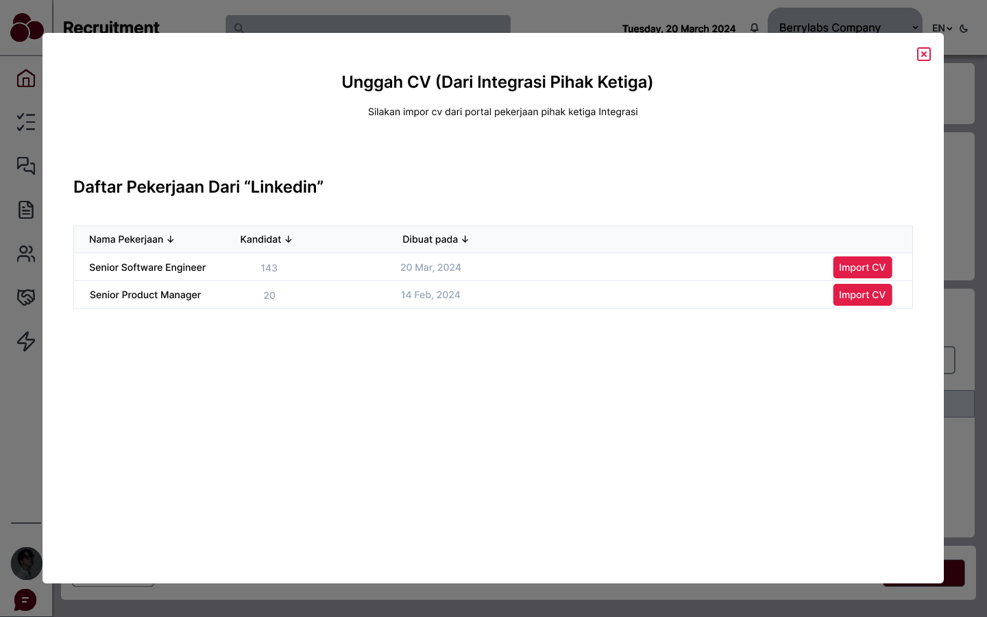
- CV upload interface: A simple drag-and-drop system for uploading resumes in various formats, with the option to upload in bulk.
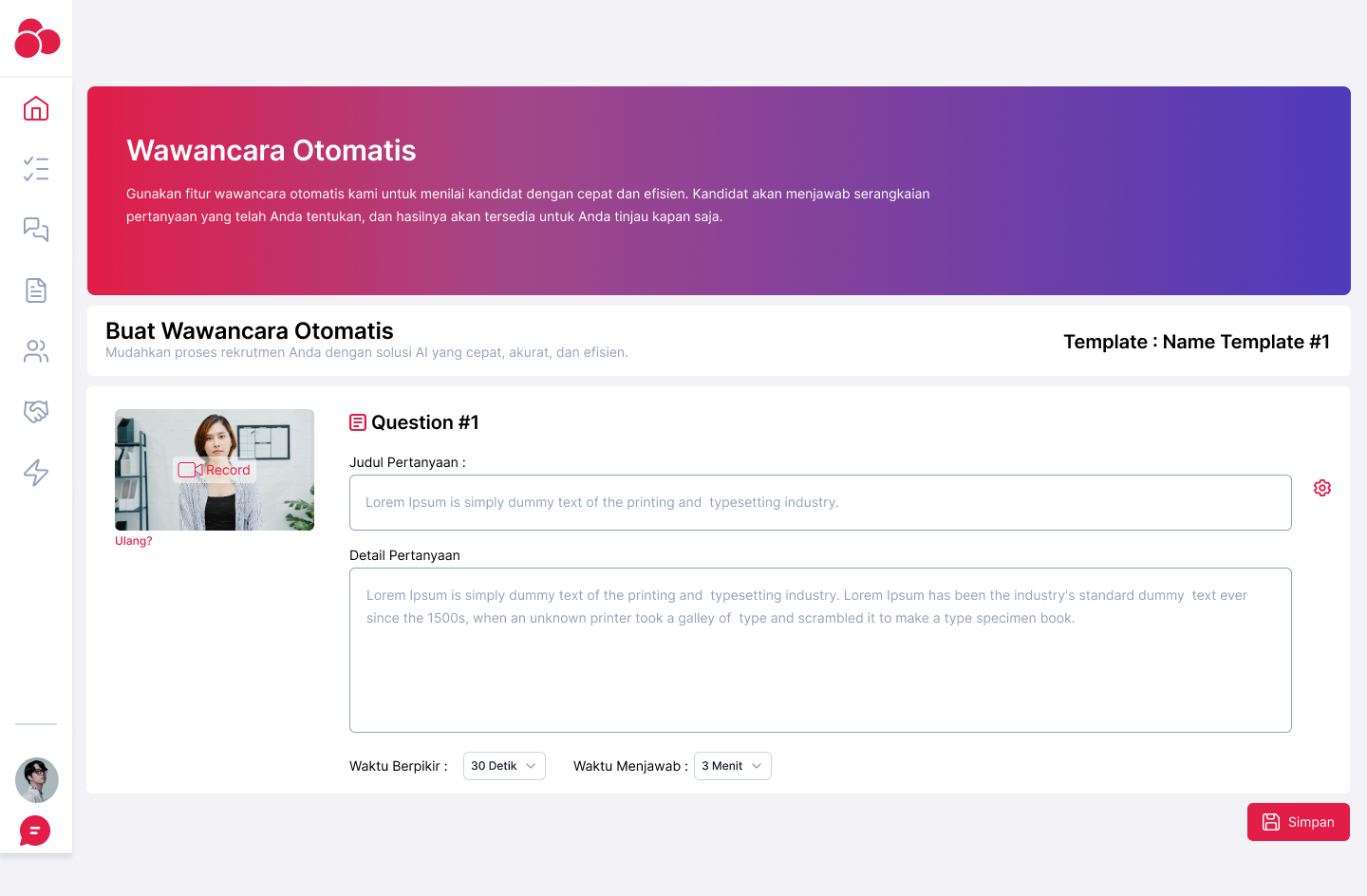
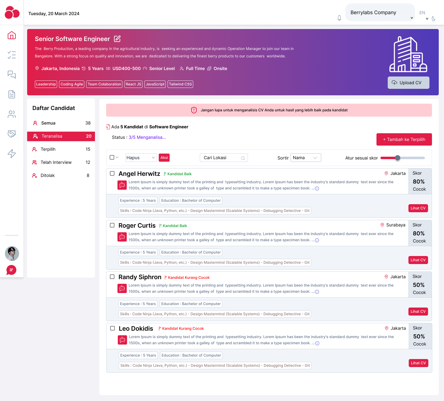
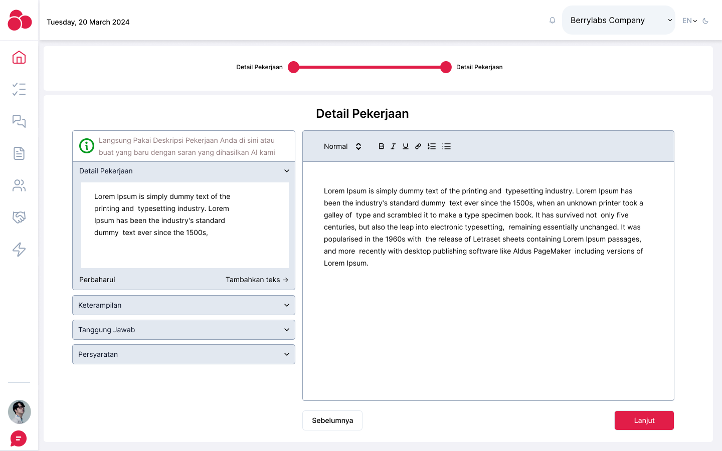
- Analysis report layout: Key insights were presented at the top (overall match score, skills analysis), with more detailed information below (education, work experience, etc.).
Wireframe
The wireframes visualized the following:
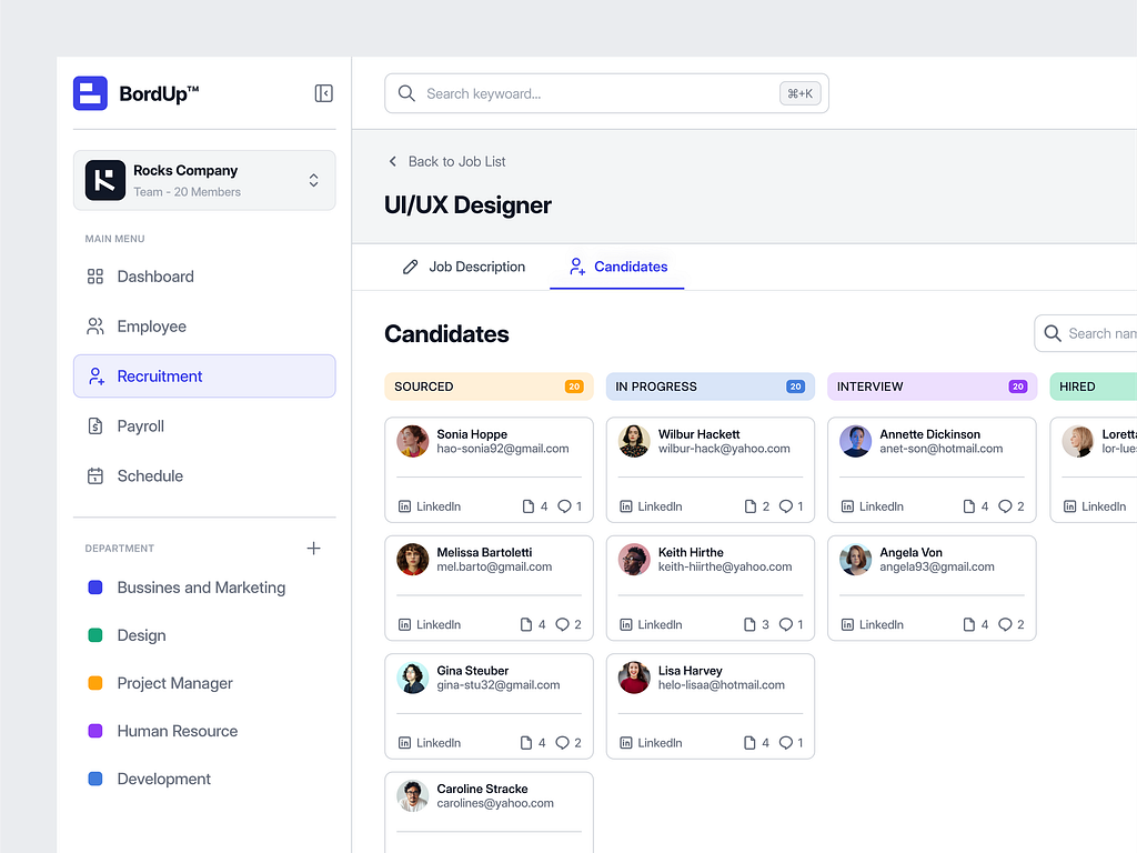
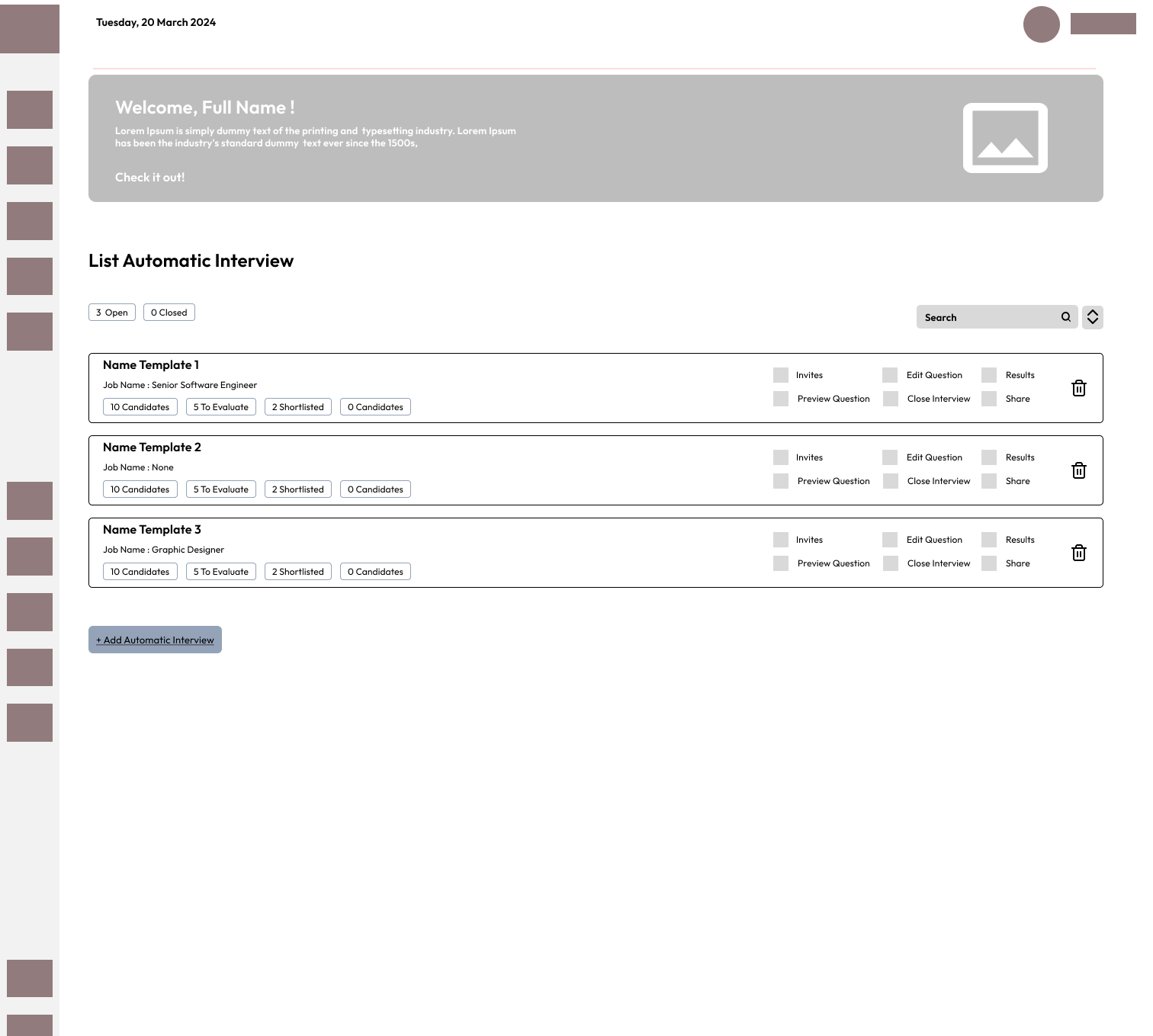
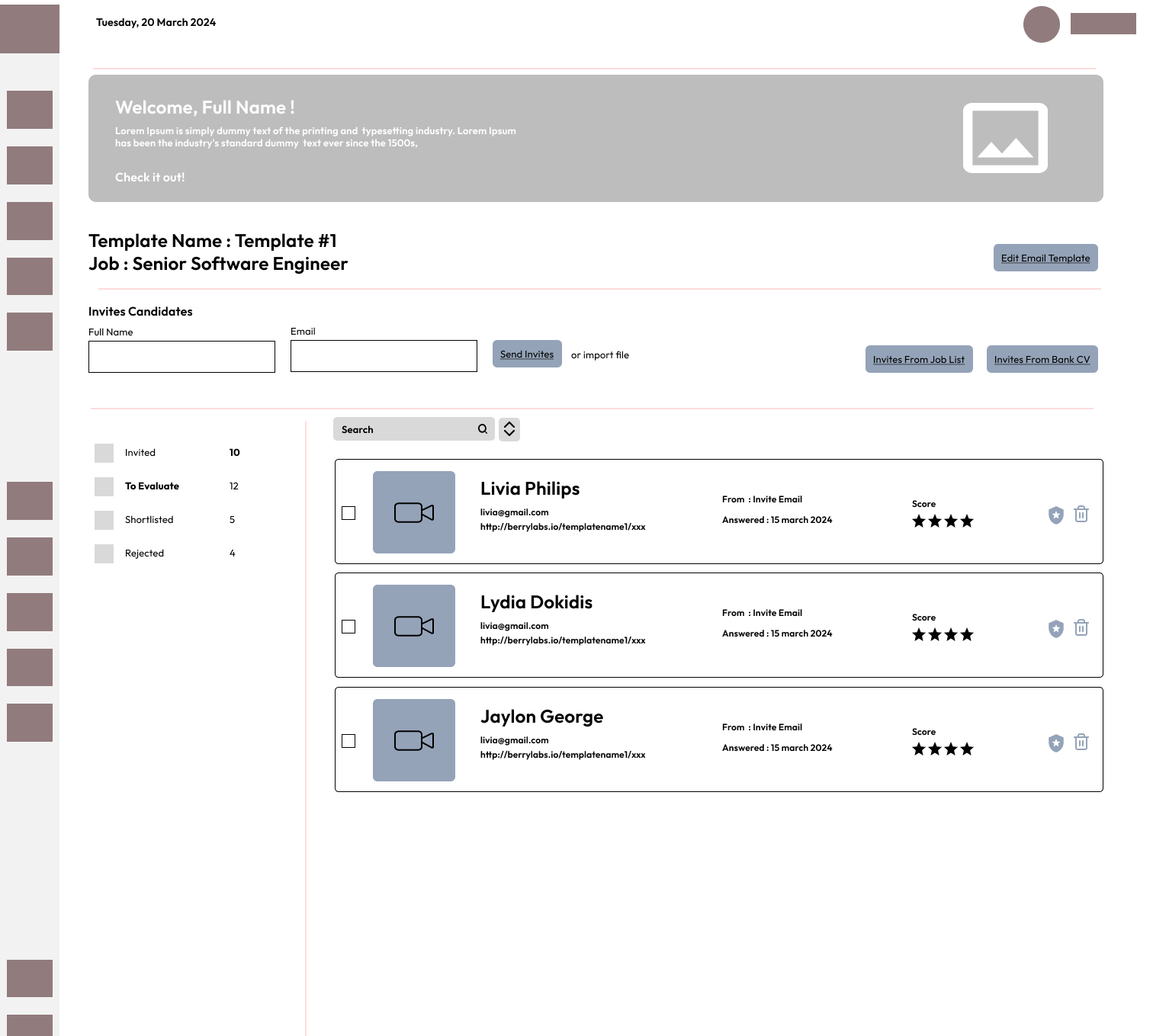
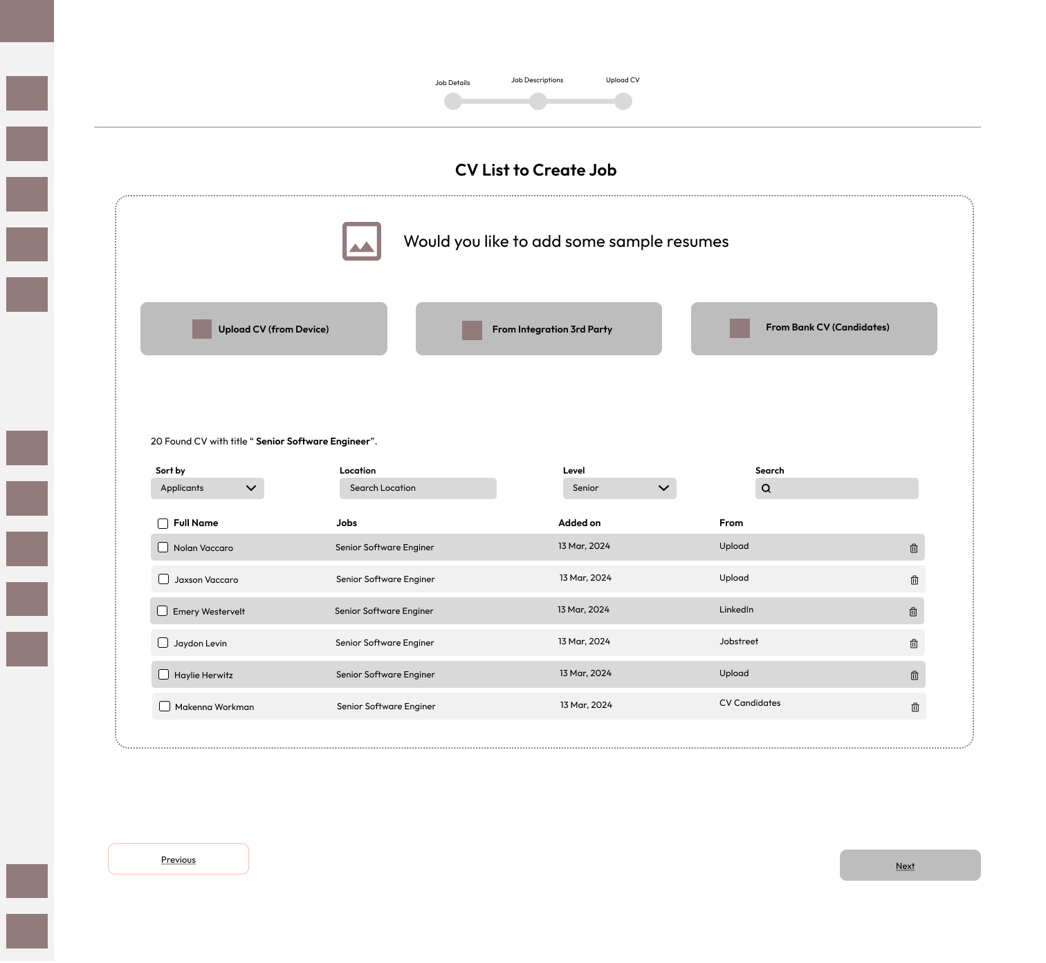
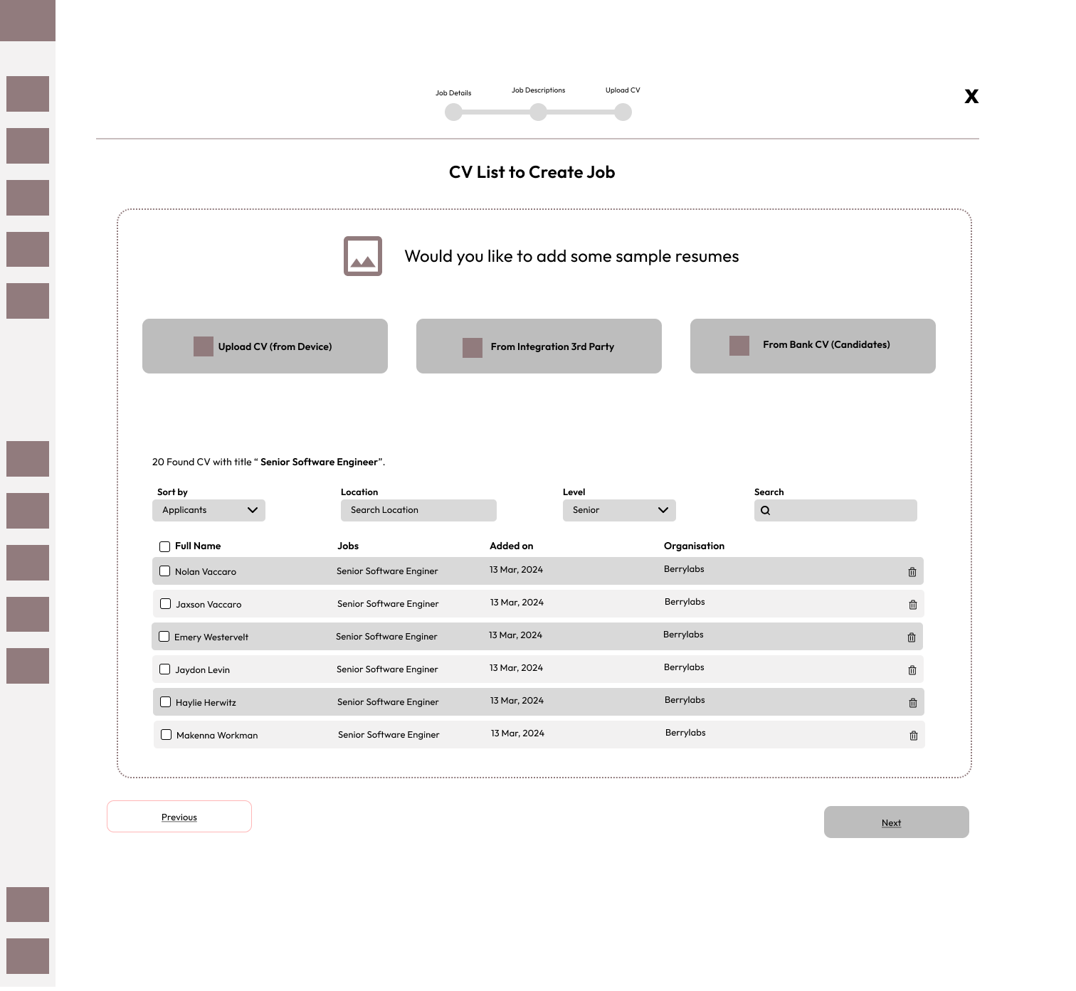
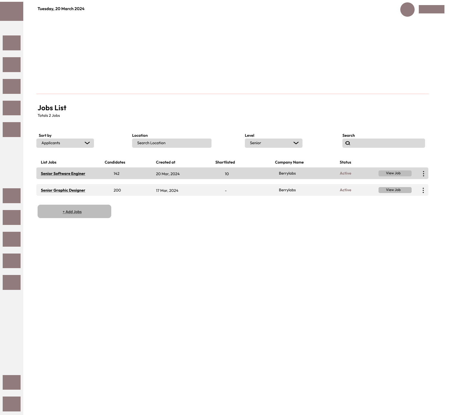
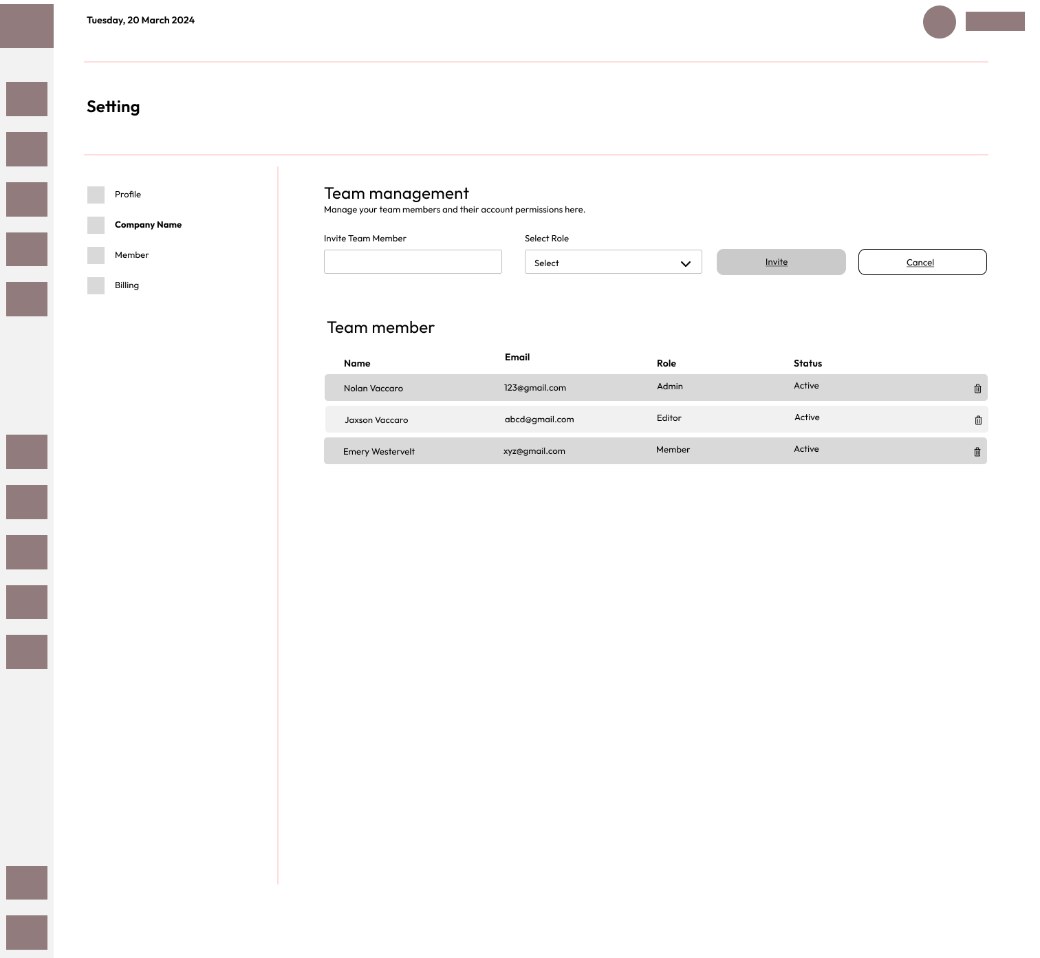
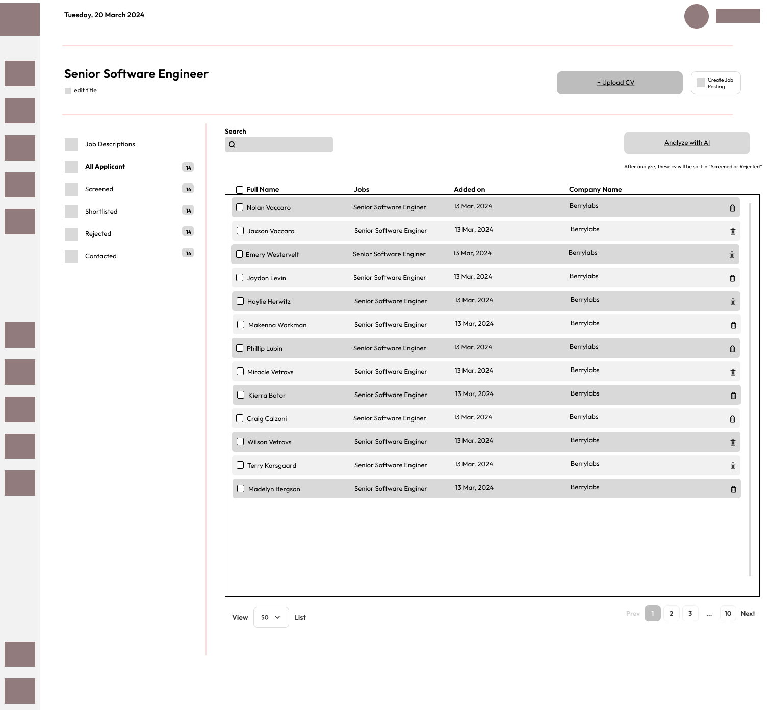
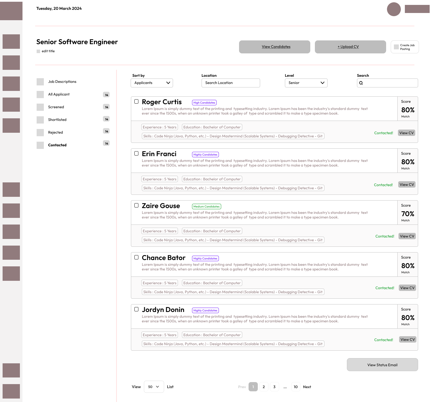
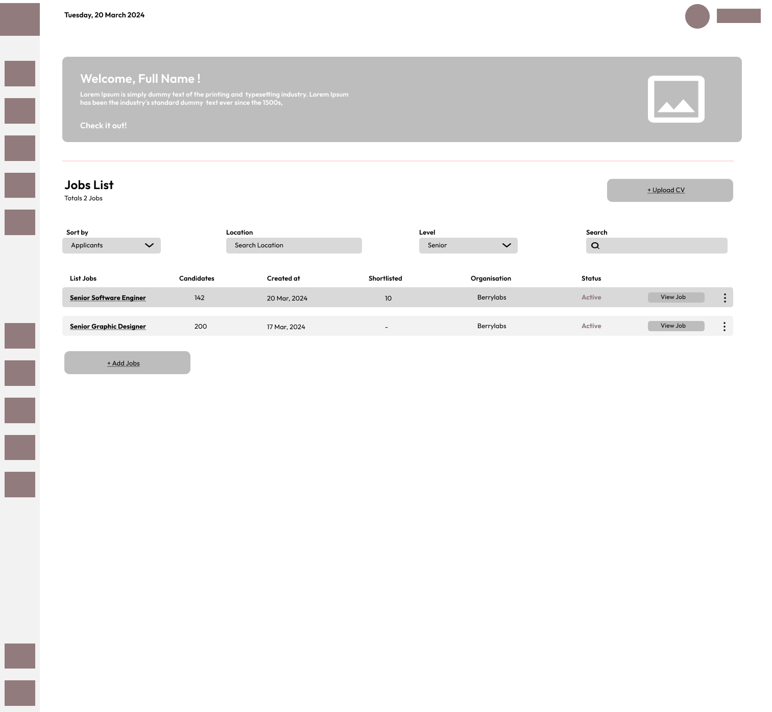
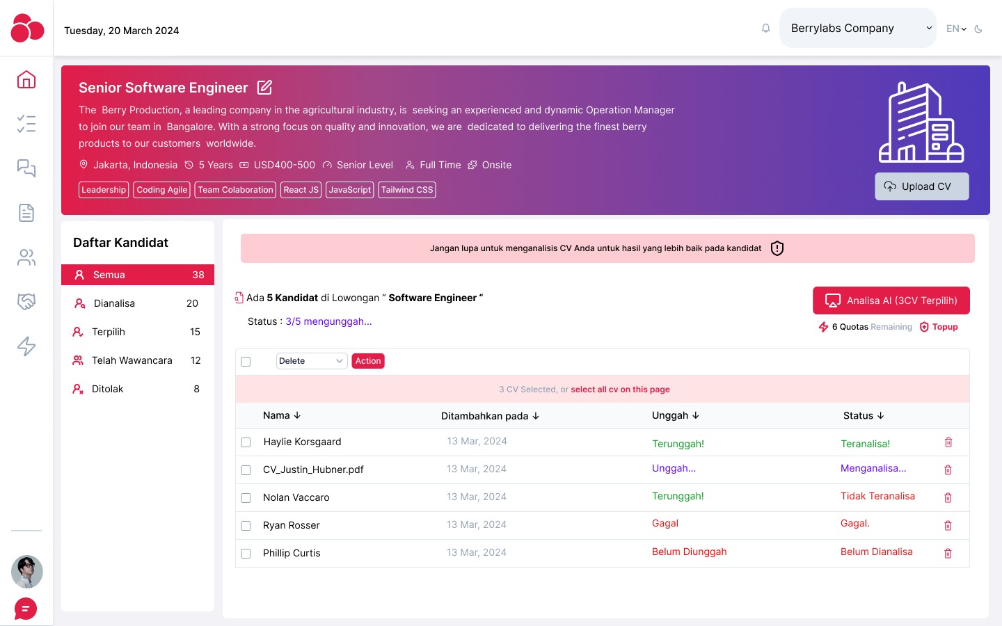
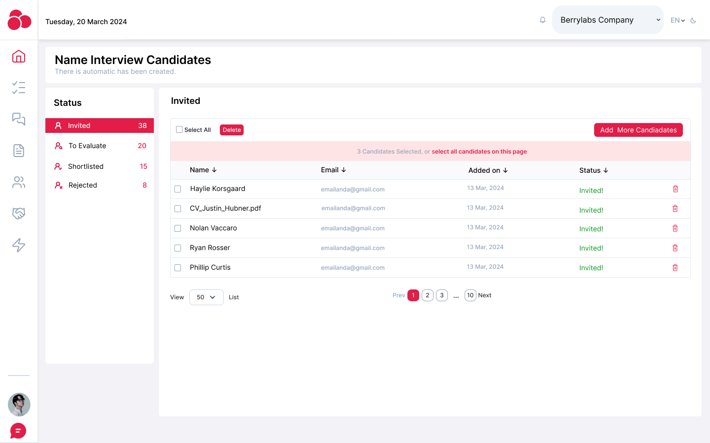
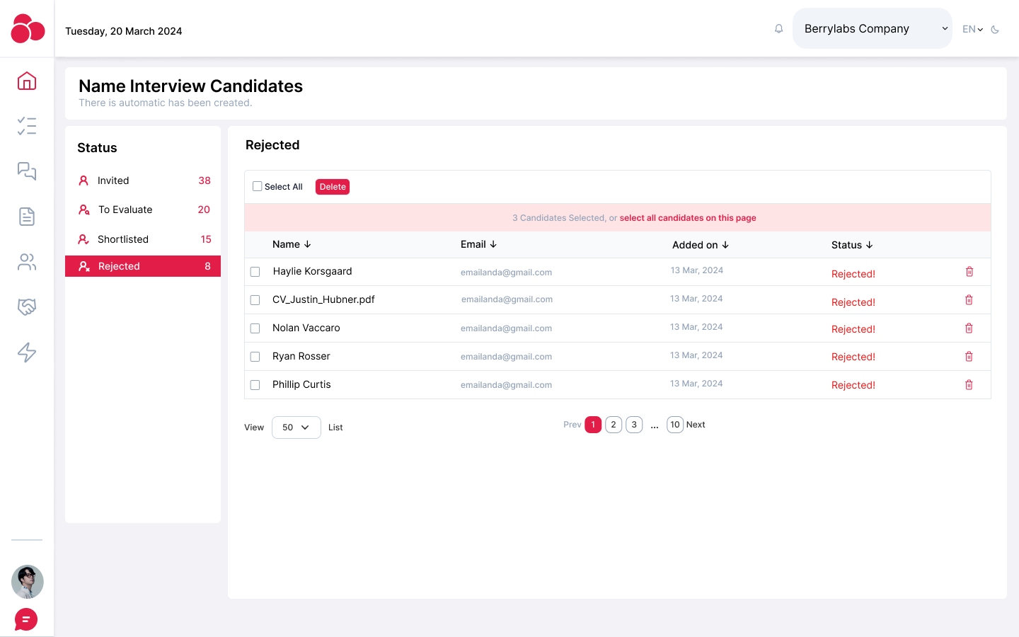
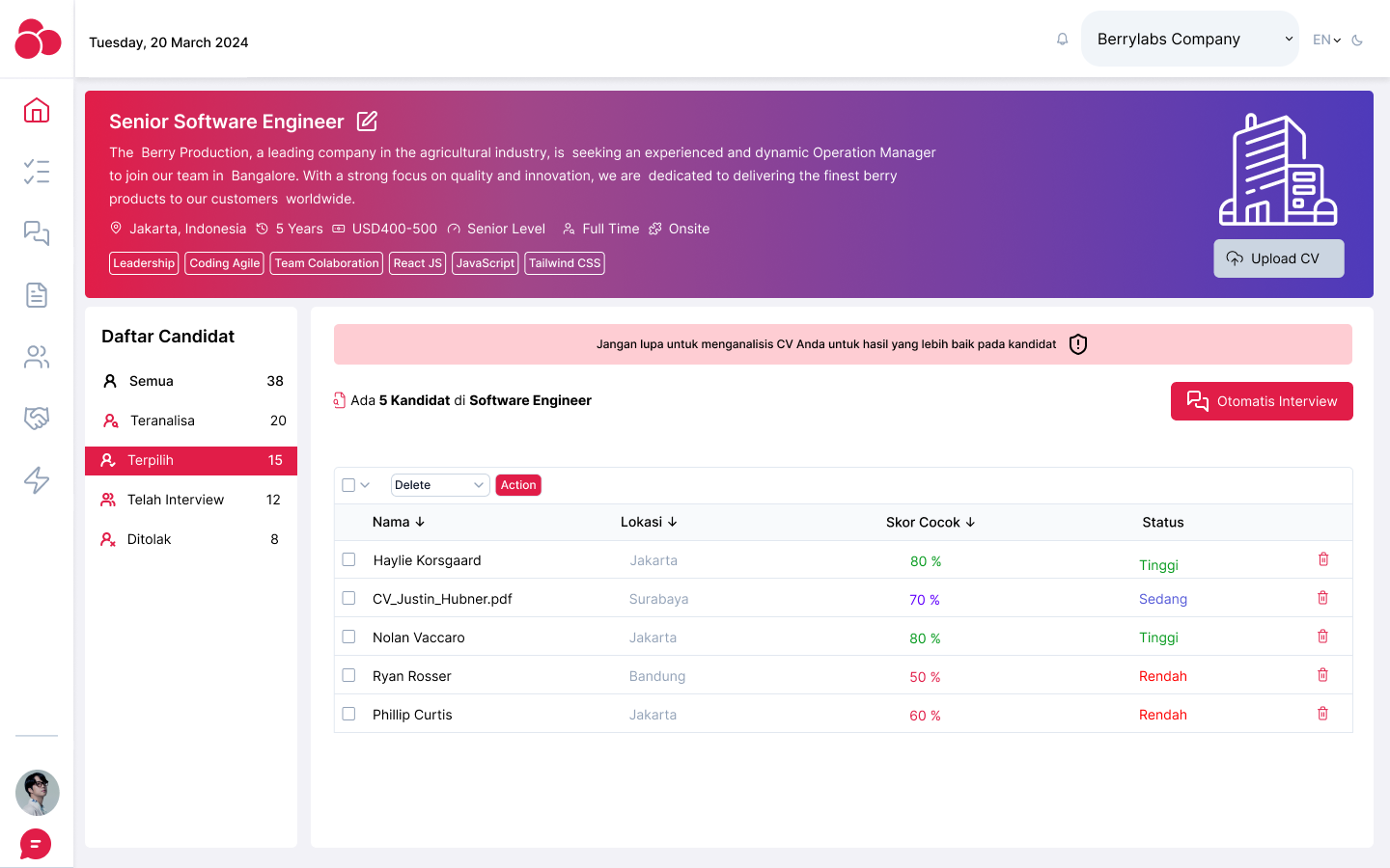
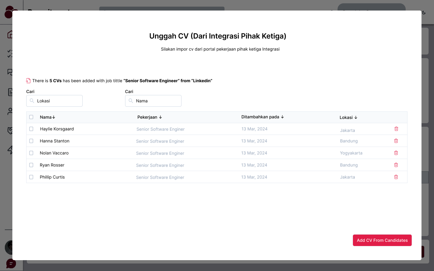
- Dashboard: A main hub where users can view the list of uploaded CVs, their analysis status, and recently completed reports.
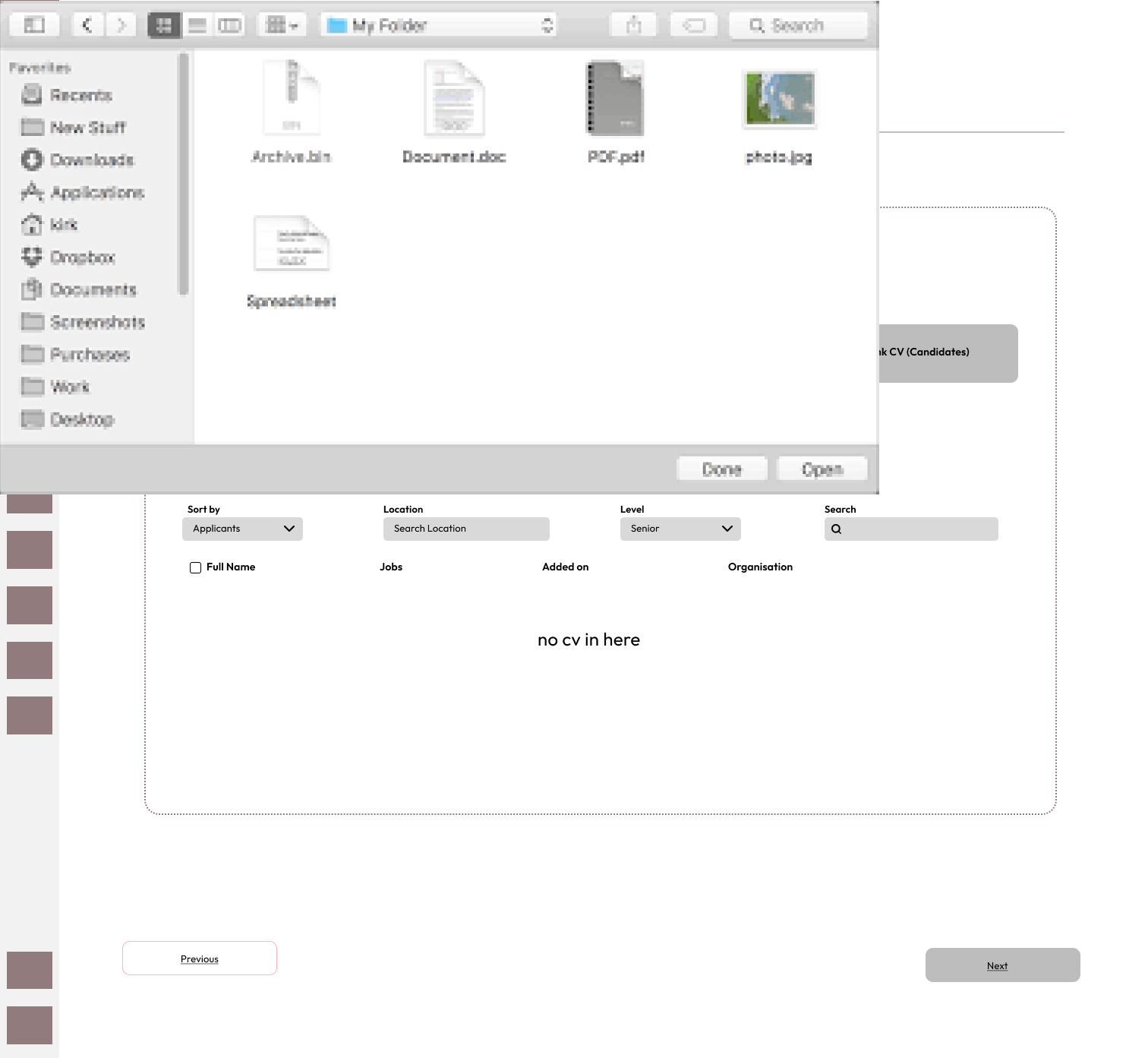
- CV Upload: A clean and simple drag-and-drop or file upload system for adding multiple CVs at once.
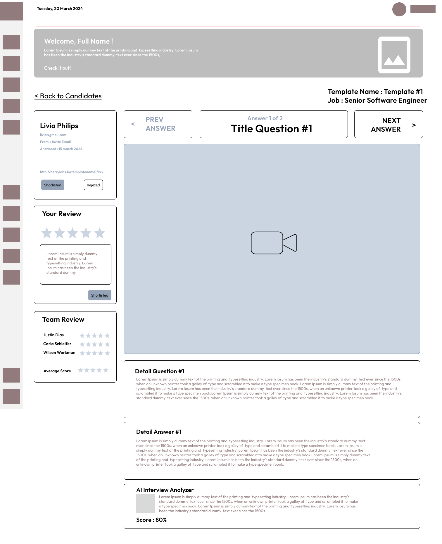
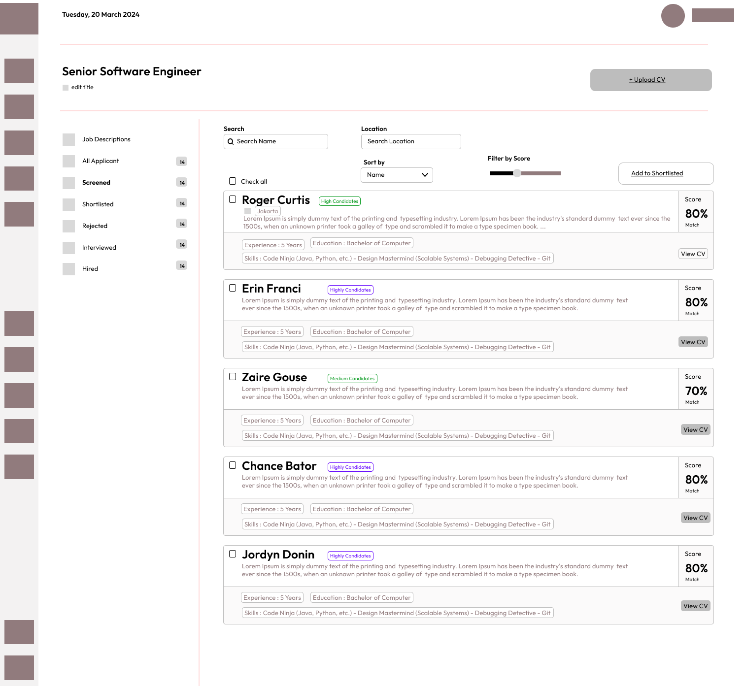
- Analysis Report: A summary section displaying the job fit score, recommended actions, and key areas of improvement for each candidate.
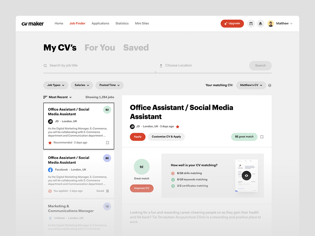
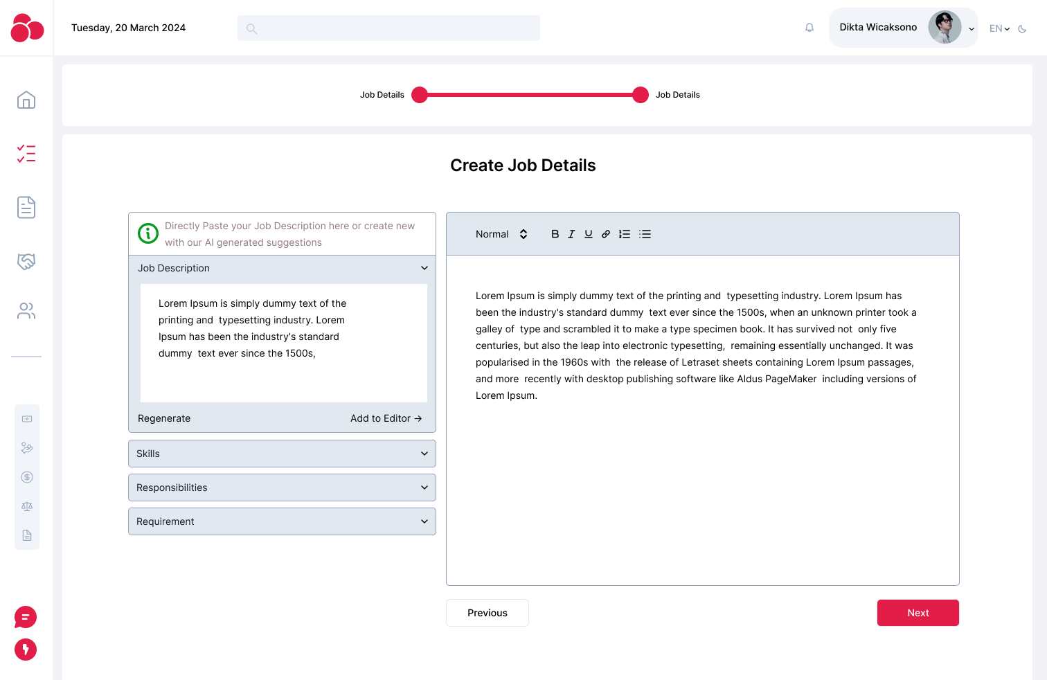
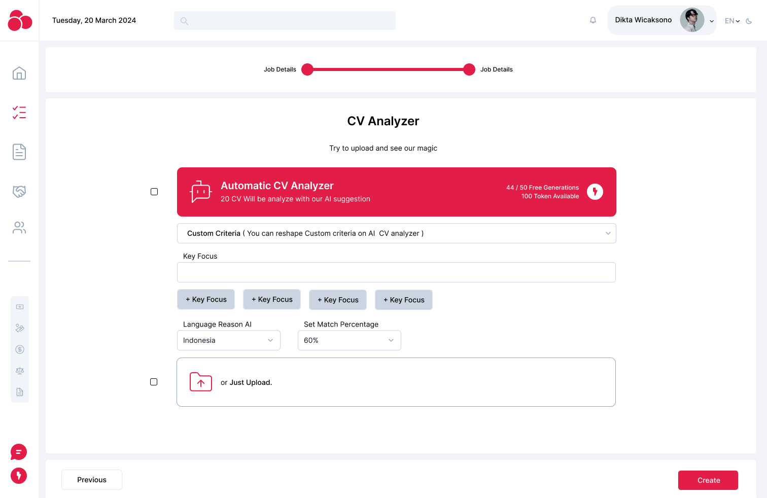
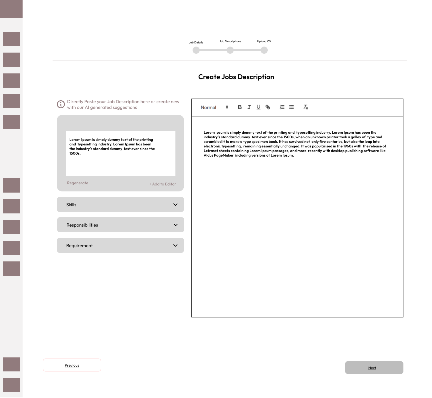
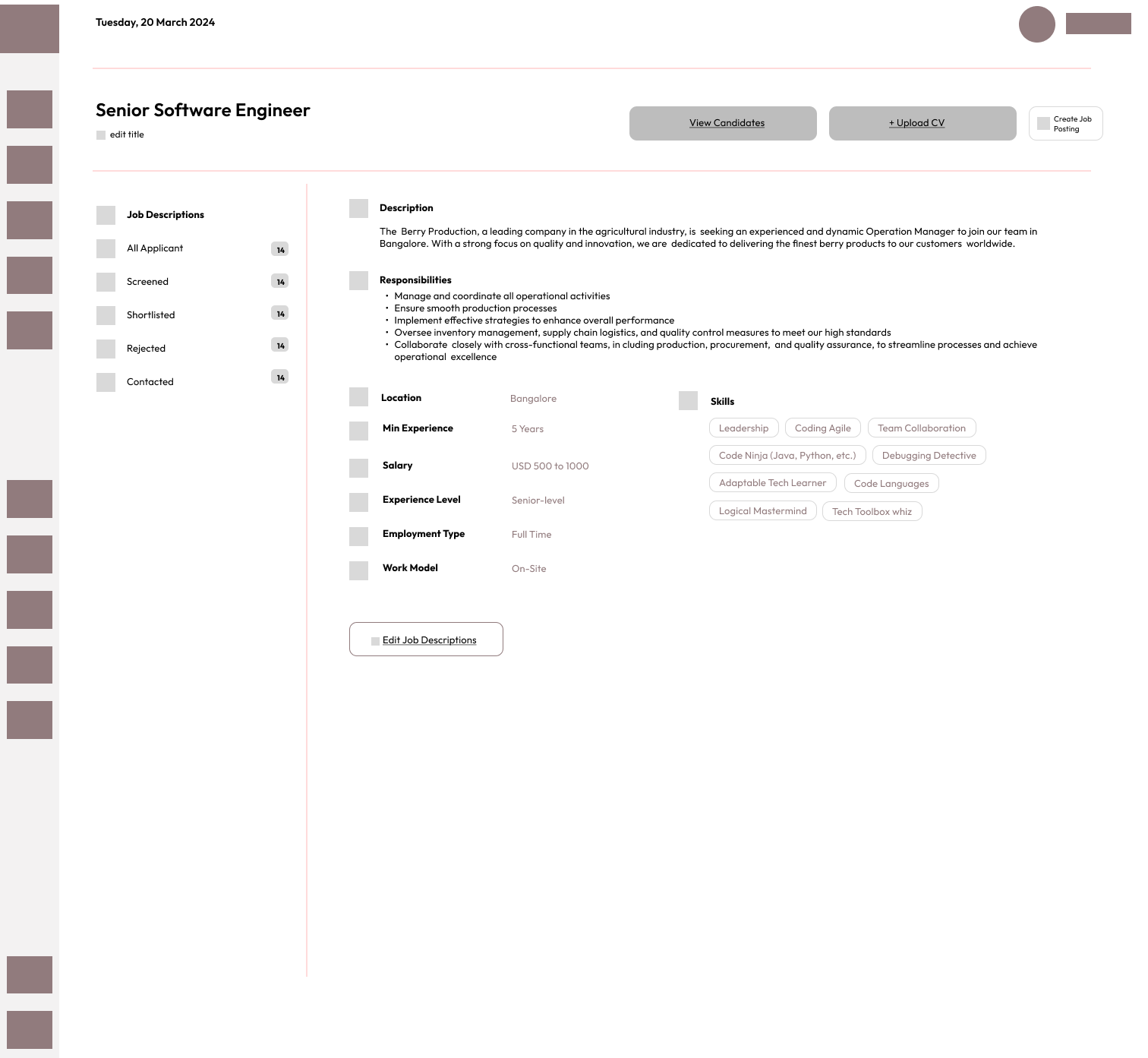
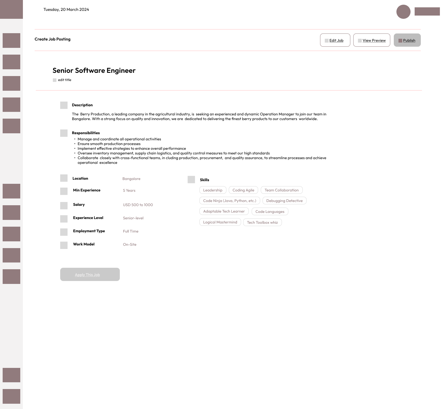
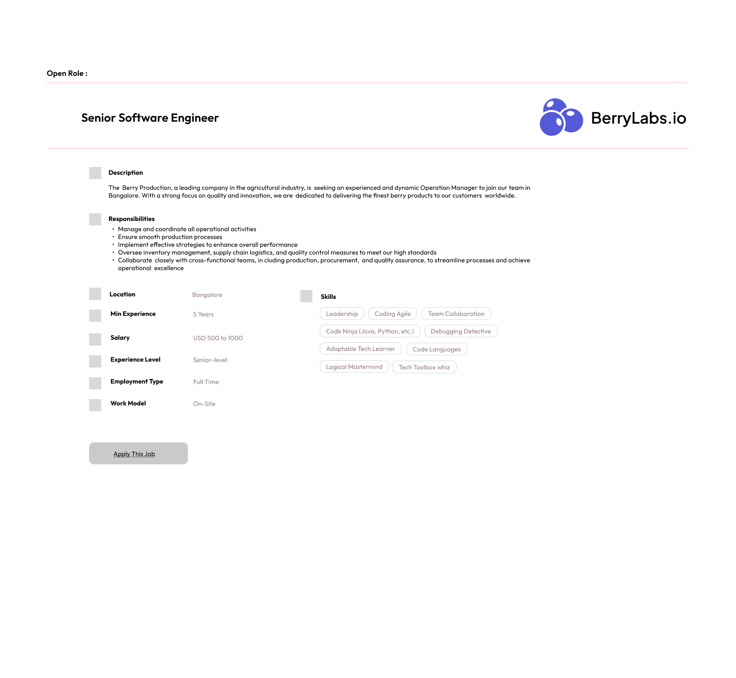
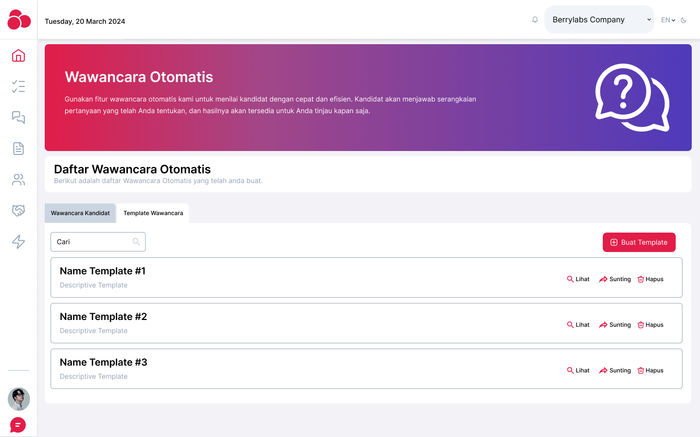
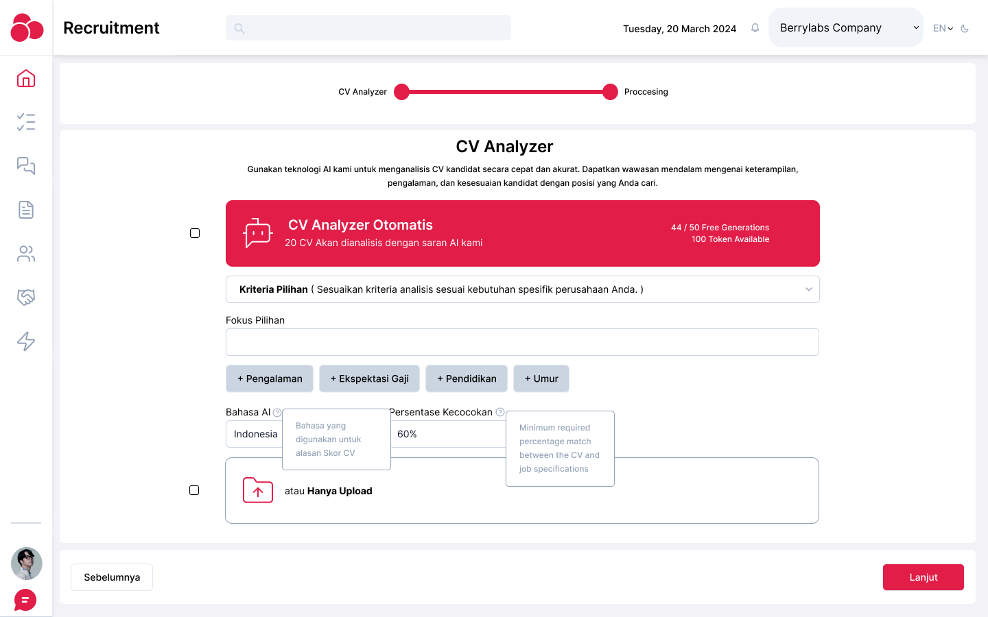
- Job Description Integration: A comparison tool that allows users to upload a job description and automatically match it against a resume, highlighting the best candidate fit.
Struggle
Some of the challenges encountered included:
- Balancing simplicity with functionality: The platform had to be intuitive for recruiters who may not be tech-savvy while still offering robust AI-powered insights.
- Presenting complex AI data in a user-friendly format: It was essential to find a way to present the analysis results in a clear, concise manner without overwhelming the user with too much technical information.
- Optimizing for multiple CV formats: Ensuring that the platform could handle various CV formats (PDF, Word, etc.) without losing important formatting or data during analysis.

Defining Design Elements
- Typography: A modern, clean font was selected to enhance readability, especially for reports and detailed insights.
- Color Palette: A professional color scheme of blues and grays was used to convey trust and reliability. Accent colors like green and red were used for positive and negative feedback (e.g., skill match or skill gaps).
- Icons and Visual Cues: Icons were integrated throughout the platform to simplify navigation, especially in areas like uploading CVs, viewing analysis status, and interpreting report results.
- Responsive Design: The platform was designed to be fully responsive, ensuring a seamless experience on both desktop and mobile devices.

Mockup
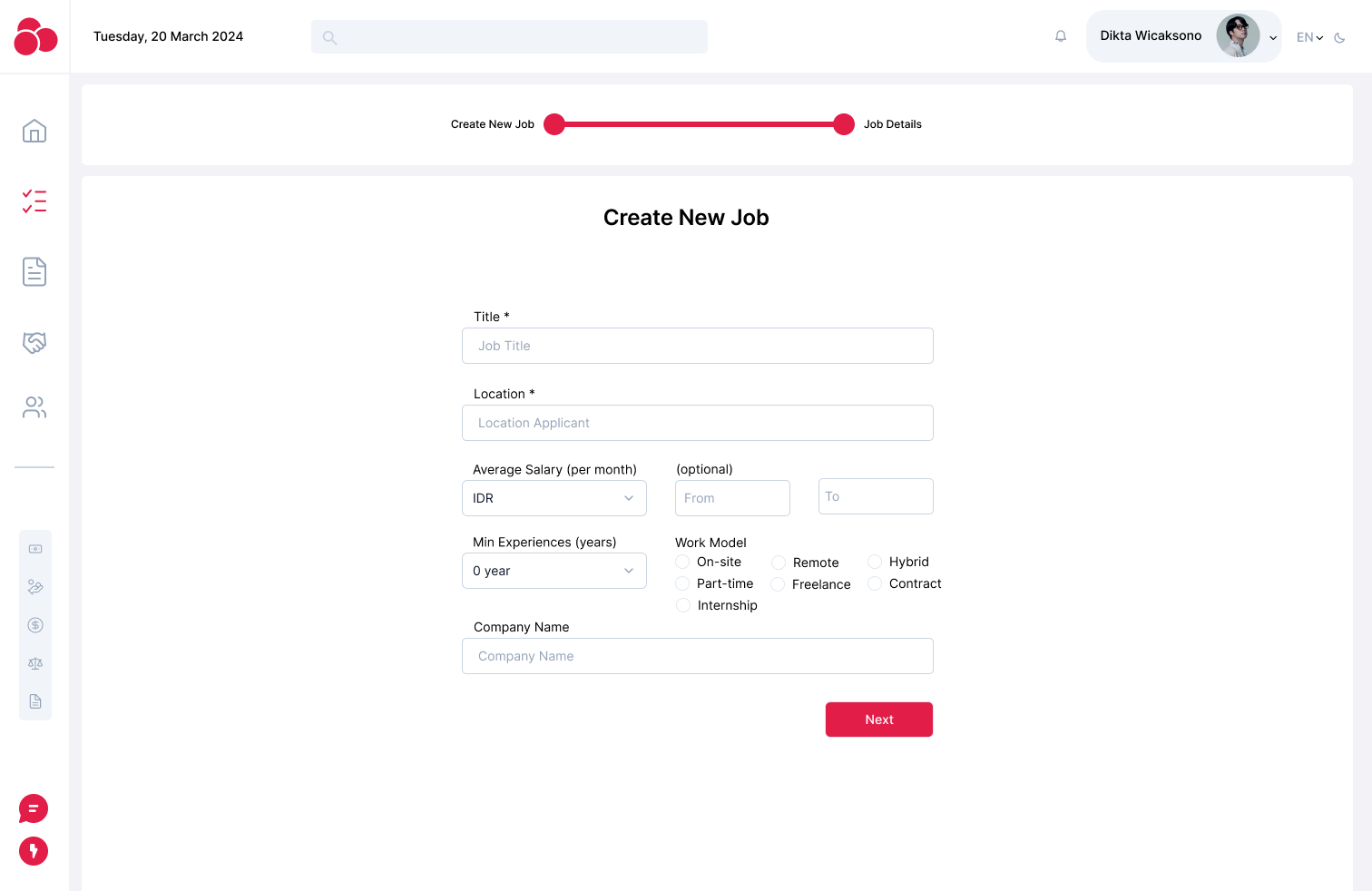
The final mockup included:
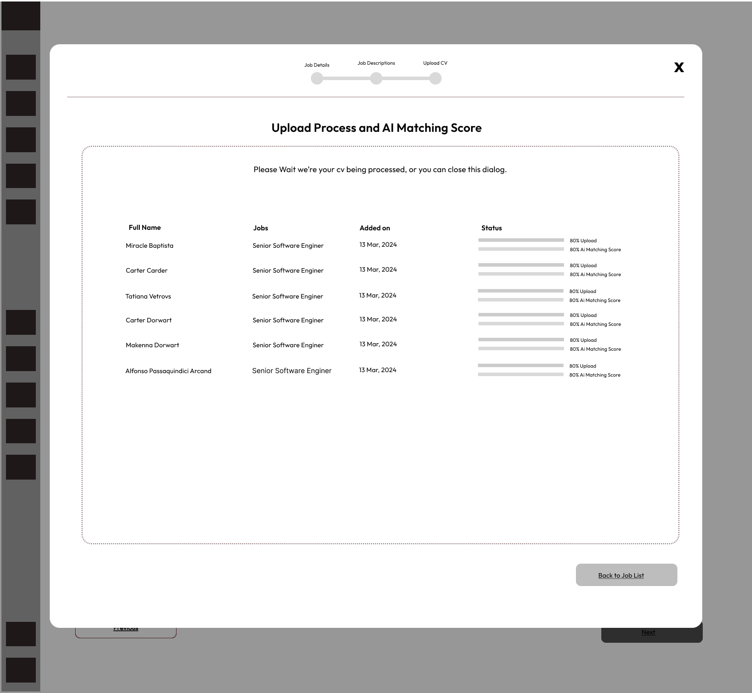
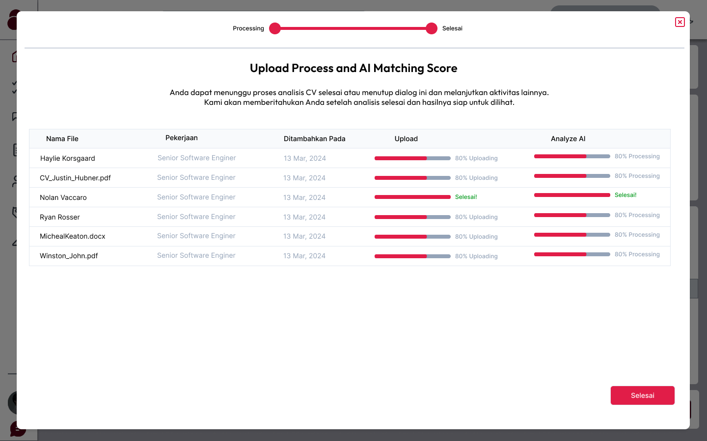
- Dashboard: A clean layout with sections for viewing uploaded CVs, analysis results, and recent reports. A progress bar indicates the status of ongoing analyses.
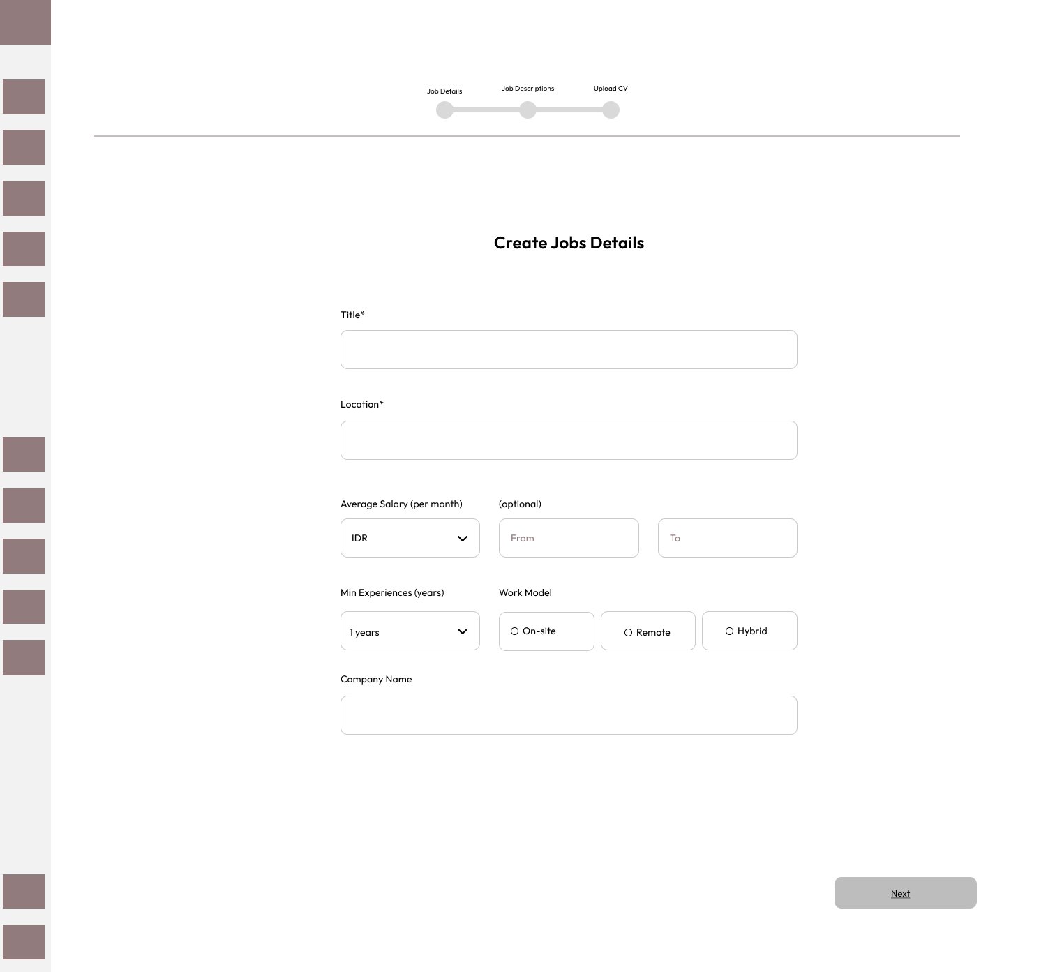
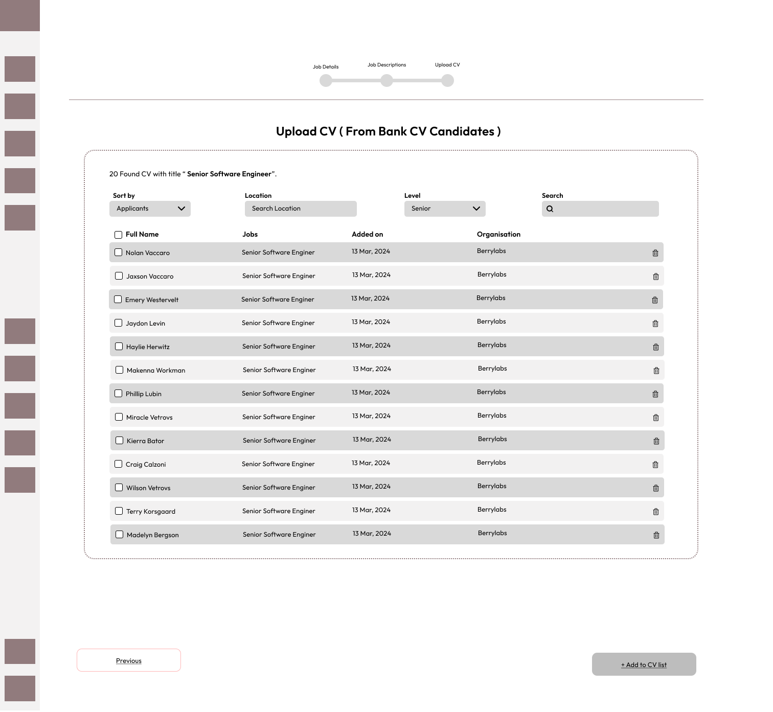
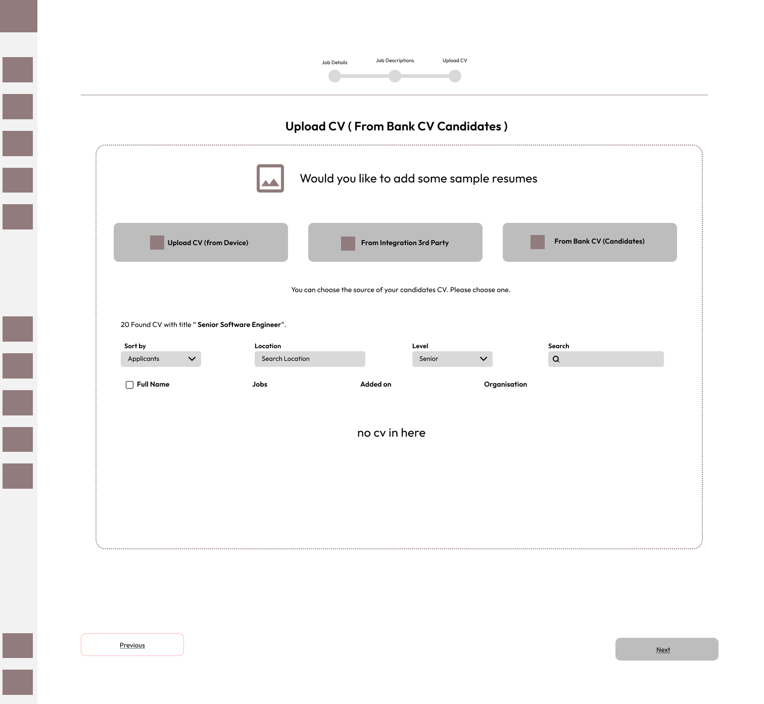
- CV Upload Screen: A drag-and-drop interface that allows users to upload one or multiple CVs with clear visual indicators of upload progress.
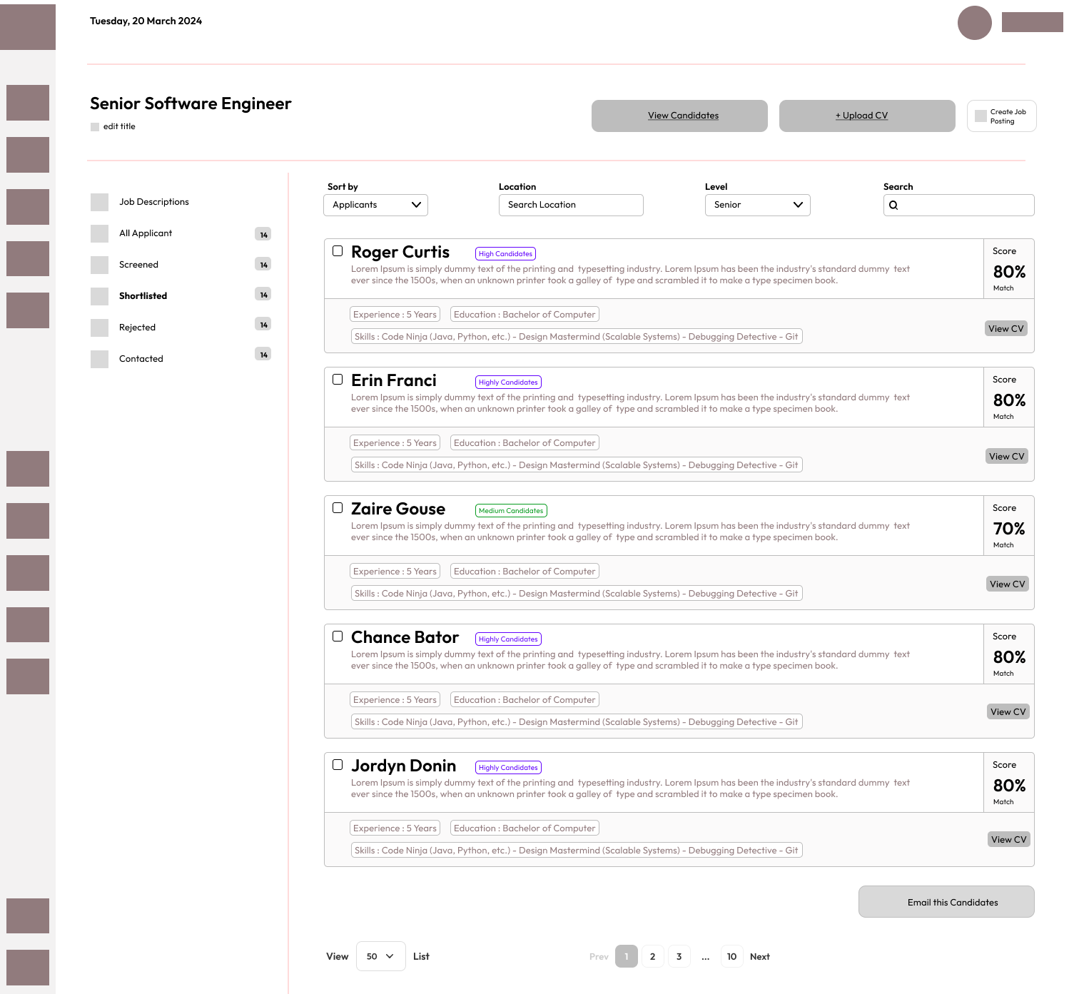
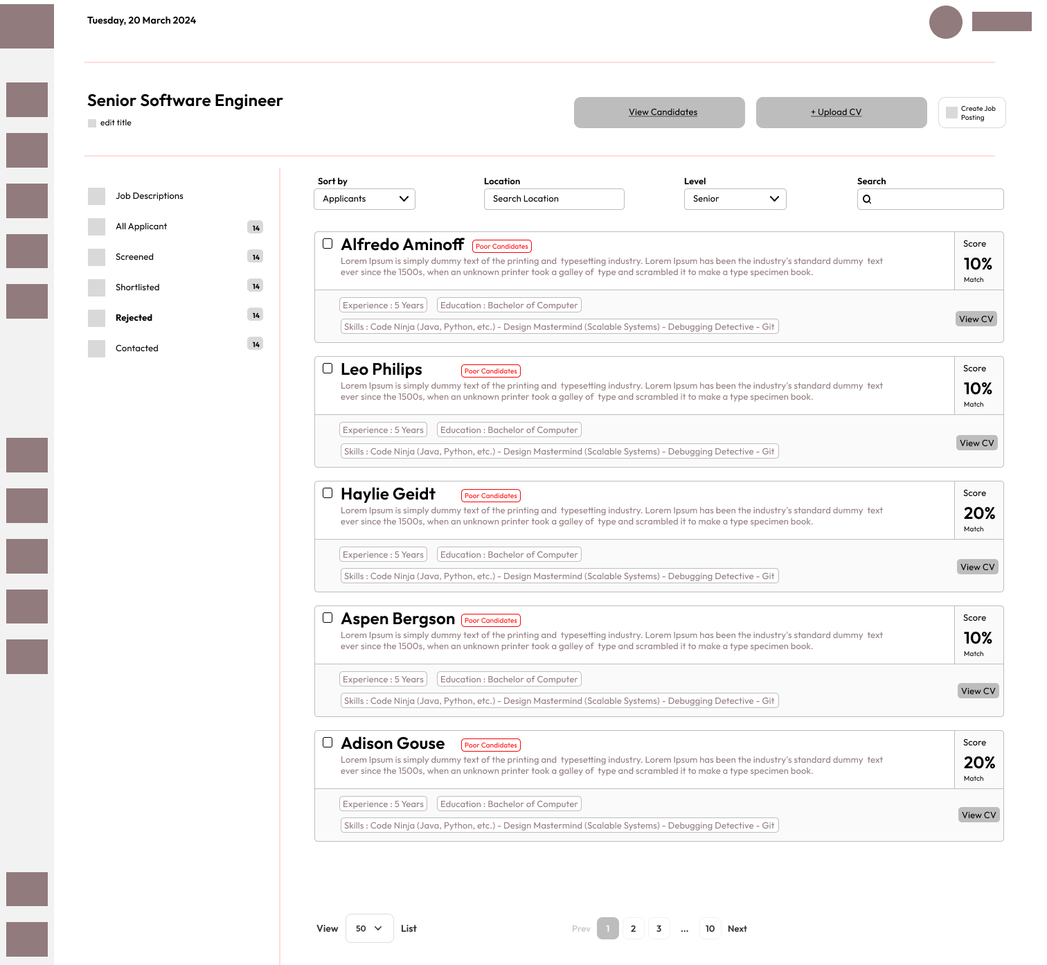
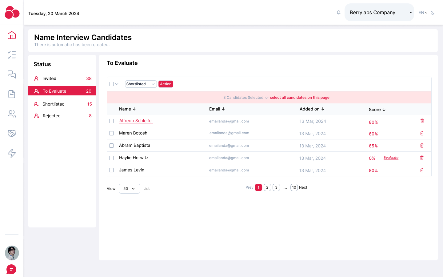
- Analysis Report: A structured report with a job fit score, skills analysis, and recommendations for each candidate. Users can filter and compare multiple candidates against a single job description.
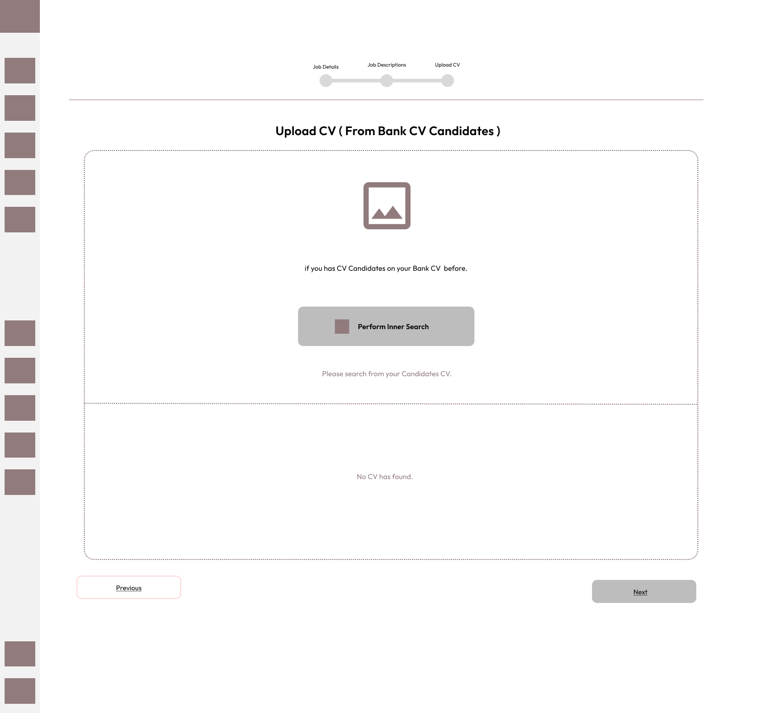
- Job-CV Matching Tool: A comparison feature that highlights which CVs best match a specific job description, ranking candidates based on their overall match score.
Design Decisions
- Simplicity first: To cater to HR professionals, the interface was kept minimal and clean, focusing on quick access to the CV upload feature and instantly actionable insights.
- AI insights presentation: AI-generated insights were broken down into categories (e.g., experience, education, skills) with accompanying visual indicators (bars, scores, percentages) to make the data easy to understand at a glance.
- Bulk uploading: Recognizing that recruiters often deal with large volumes of CVs, the upload process was designed to handle multiple CVs at once while providing real-time status updates.
Result
The final product resulted in:
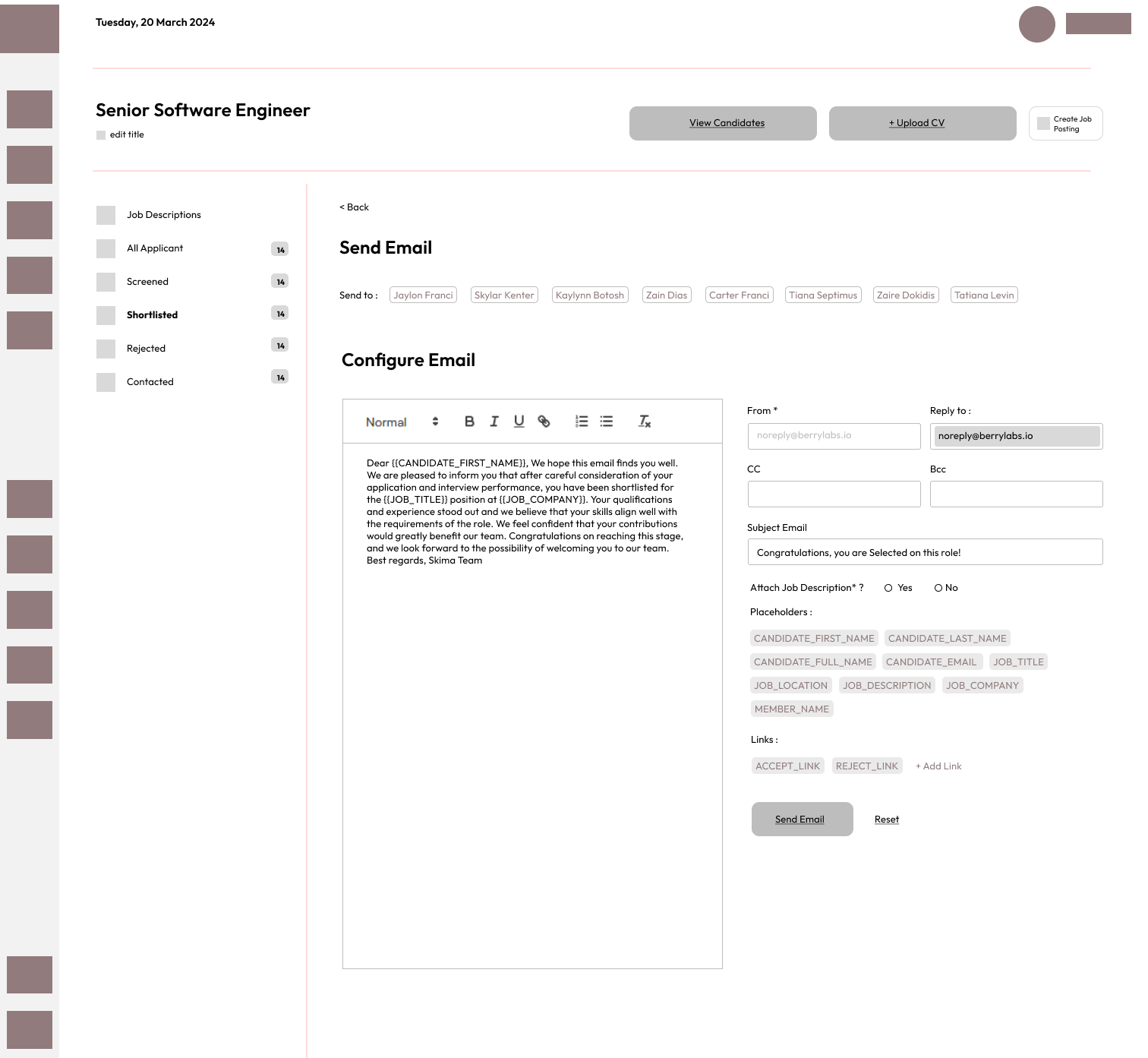
- Increased efficiency: Recruiters reported significant reductions in the time spent manually screening CVs, with AI-driven insights speeding up the shortlisting process.
- Enhanced candidate matching: The AI-based analysis helped improve candidate-job fit by automatically ranking resumes according to job descriptions, allowing recruiters to focus on the most relevant candidates.
- Positive user feedback: During testing, users appreciated the ease of use, clarity of the insights provided, and the professional look and feel of the platform.
This case study demonstrates how Hirefazz, an AI-powered CV analyzer SaaS web service, successfully combined advanced AI-driven technology with user-centric design to create a product that streamlines the recruitment process and enhances the quality of candidate evaluation.
Are you ready to dive deeper and discover more of our exciting projects filled with creativity?
